Links and Hypertext
Link Text and Appearance
Link Text
Avoid uninformative link phrases
Links are more useful when they make sense out of context. Authors should avoid non-informative link phrases such as:
- click here
- here
- more
- read more
- link to [some link destination]
- info
In fact, the phrase "click here" is unnecessary, even if it precedes a more meaningful phrase. For example, a link that says "click here to access today's weather" can be shortened to "today's weather." In some cases it may make sense to precede a link phrase with "more" or "read more about," (e.g. "more about global warming"), but if these extra words can be avoided, it is probably best to avoid them (e.g. "global warming" may convey the same meaning as "more about global warming," depending on the context).
Link length
Long links
There is no maximum allowable length of link text. For practical purposes, the link needs to be long enough to convey the purpose of the link and no longer. Content authors have the freedom to give meaning to their content in the ways that make sense to them. Still, as a general rule, links should be as concise as possible without sacrificing meaning.
Some authors make links out of entire sentences, paragraphs, or even multiple paragraphs. These long links are almost certainly unnecessary, and are user-unfriendly for screen reader users. Remember that blind users cannot visually skim through lengthy links. They must listen to the entire text. Some get frustrated with long link text and impatiently move on to the next link if they cannot understand the purpose of the link after the first few words. Although authors cannot control this behavior, they can control some sources of frustration. Short, concise links are less likely to frustrate screen reader users than long, imprecise links.
Short links
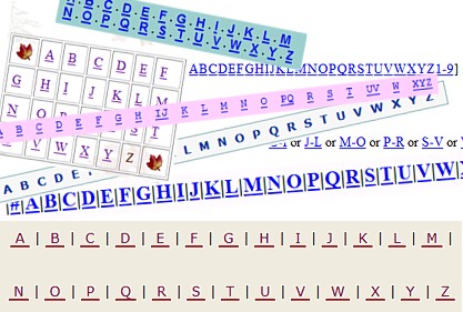
Similarly, there is no minimum allowable length of link text, so long as the link is not empty (see below). In most cases, links should be words or phrases. In some instances, though, it may make sense to link a single character, letter of the alphabet, or numeral. For example, an alphabetical index may use each individual letter of the alphabet as a link.
The danger in using single characters as links—or in using any sort of small link (such as a 10 pixel by 10 pixel graphic)—is that some users will have difficulty clicking on such a small area. Someone with cerebral palsy, for example, may be able to use the hands to manipulate a mouse, but may have difficulty with the precise movements and muscle control necessary to click on a small link. Authors can limit these issues by increasing the size of small links, increasing the font size of single character links, or making the target area larger by including whitespace (such as CSS padding) within small link. Additionally, small adjacent links should have adequate whitespace (such as link CSS margins) between them to minimize users inadvertently clicking the wrong link.
Empty links
Links should never be empty. They must always contains text or images with alternative text. An empty link can be navigated to, but it does not present any content. This can be very confusing for keyboard and screen reader users.
URLs as links
Web addresses, or URLs, present two types of challenges:
- Readability
- Length
URLs are not always human-readable or screen-reader friendly. Many URLs contain combinations of numbers, letters, ampersands, dashes, underscores, and other characters that make sense to scripts and databases but which make little or no sense to the average person. In most cases, it is better to use human-readable text instead of the URL. The human readable link Constructing Accessible Web Sites is more user-friendly than the link to purchase the book by the same title on Amazon.com, which consists of a 108-character link full of numbers, slashes, and text that is not very human-readable. (http://www.amazon.com/exec/obidos/ASIN/1590591488/qid=1116957951/sr=2-1/ref=pd_bbs_b_2_1/103-5755258-8204633)
Does this mean that URLs should never be used as links? No. If the URL is relatively short (such as a site's homepage), the URL may be used as the link text. The key is to be considerate of screen reader users who must listen to the longer, less intelligible URLs.
Alternative text for images used as links
When images are used as links, the alternative text performs the function of link text. As with linked text, the alt text of linked images does not need to inform users that the link is a link, since this is already presented. The alternative text should convey the content of the image and the function of the link. In most cases, the content of the image and function of the link are the same, so this text can be very succinct (e.g, alt="Products"). In some cases, it may require more text (e.g., alt="Chart showing 10% sales increase over the last decade with link to more sales data.").
Images that are the only thing within a link MUST have alternative text.
If a linked image does not have alternative text, a screen reader may read the image file name or the URL being linked to.
Link Appearance
Links should look like links, and nothing else should. Users may get frustrated if they try to click on textual phrases or graphics that look like links but are not. They will also be frustrated if they have to move their mouse all over the page trying to discover links that do not look like links.
Underlining
Browsers underline hypertext links by default. It is possible to remove the underline using Cascading Style Sheets (CSS), but this is a bad idea most of the time. Users are accustomed to seeing links underlined. In body text, they may or may not be able to figure out which text is linked if the underline convention is not used.
Although users are accustomed to seeing links in the main content underlined, they are also accustomed to seeing tabs and main navigational features (oftentimes created as graphics rather than text) without underlining. In these cases, the linked items should be designed so it is apparent that the user can click on them to perform an action.
WCAG 2.0 has 2 additional requirements for body text links that are not underlined by default:
- The link text must have a 3:1 contrast ratio from the surrounding non-link text.
- The link must present a "non-color designator" (typically the introduction of the underline) on both mouse hover and keyboard focus.
These two requirements help ensure that all users can differentiate links from non-link text, even if they have low vision, color deficiency, or have overridden page colors.
Hover and focus effects
Many sites have implemented visual mouse hover effects for links, such as adding background glows, drop shadows, color changes, or underlining. These effects help users know that the item can be clicked on and that mouse focus is on a particular link.
To make these effects device-independent, it is necessary to ensure that it can be activated by either the mouse or the keyboard. In CSS, this means using both the :hover and the :focus pseudo-classes.
Nearly any time a:hover (or other hover effects) are defined in CSS, it should be modified to be a:hover, a:focus to ensure the same visual presentation is available when keyboard users navigate or 'tab' to the link.