Text/Typographical Layout
Note
This article covers text and typographical layout. To learn more about accessibility of text characters and glyphs, see the WebAIM article on Typefaces and Fonts.
Text Alignment
By default, browsers align text to the left. Text can also be aligned to the right, centered, or justified (aligned on both the left and the right margins). Left-aligned text is almost always the easiest to read, except for some Asian and Middle Eastern languages that conventionally read vertically from top to bottom or horizontally from right to left.
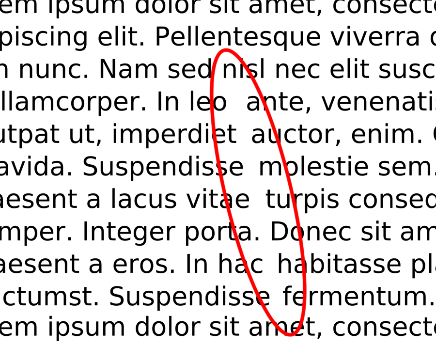
Long blocks of centered text result in each new line beginning in a slightly different location. This can introduce overhead when reading.
Fully-justified text forces each line to extend to both left and right margins by adjusting word and letter spacing. Although the resulting presentation may appear more tidy at first, these spacing variations impair readability. Fully-justified text can also create distracting "rivers of white"—patterns of unintended whitespace that distract the eye from the natural flow of the text.
Some circumstances, like centered headings or a right-aligned date on a document, for example, might be appropriate, but these should be treated as exceptions.
Margins, Padding, and White Space
White space to set the content apart
Documents with empty space, or "white space," around blocks text are generally easier to read and scan. The space helps the reader focus on the text and creates a cleaner layout. However, when text pushes close to the edge of the viewing area, the document may feel more cluttered, lines of text may be longer, and some readers with reading disabilities may find it more difficult to read.
When designing for small screens, the amount of white space within margins may be limited to better ensure an optimal line length.
White space to distinguish paragraphs
Paragraphs and other blocks of text content should be easily distinguishable from each other. Browsers insert vertical space between paragraphs by default. An alternative method of separating paragraphs is to eliminate the extra space above and below them, and instead indent the first line of each paragraph. Print materials such as books and magazines usually follow this convention. Because online content tends to involve scrolling, paragraph spacing makes it easier to differentiate paragraphs.
Line Length
Long lines of text (many characters per line) require user effort to track back to the beginning of the next line. Very short line lengths result in a lot of time spent tracking to the beginning of subsequent lines.
Line length is impacted by the typeface, text size, and word/letter spacing, as well as the end user's display size and settings. While there is not a universally optimal number of characters per line, in general, fewer than around 50 or more than around 120 characters per line will likely introduce difficulty.
There are exceptions.
Short lines are needed sometimes.
Like in a haiku.
Responsive web design, minimum and maximum widths, variable widths based on the viewport size, etc. can be implemented to ensure line lengths are suitable.
Text Decorations
Underline
The convention of underlined links has been around as long as the World Wide Web. Using underlined text for other purposes on the web will likely confuse some users, who may attempt to click on the underlined terms. Similarly, links that are not underlined may not be as obvious.
Delete <del>, insert <ins>, and strike-through <s>
Deleted text can be indicated using the <del> element, which causes the text to appear with a strikethrough. Text inserted into a document can be identified using the <ins> element. The <s> element can be used to strike out text that is no longer relevant or accurate.
Deletions, insertions, and strikethrough are sometimes used in legal documents to show changes from one version to another. Unfortunately, screen readers do not always notify users when these elements are used, so it can be difficult to tell if the author has marked passages as crossed out. The makers of screen reader software should have fixed this issue long ago, but they haven't. These limitations might be addressed by adding text to the page (perhaps using CSS ::before and ::after) to indicate the beginning and end of insertions and deletions.
CSS line-through creates a visual strikethrough effect, but this is never conveyed to screen reader users.
Blink and marquee
Users with attention deficits or cognitive disabilities can be easily distracted by blinking or scrolling text. If scrolling text contains links, people with limited fine motor abilities may not be able to click on the moving links. Although neither blinking text nor marquee text is likely to cause a seizure, many users find these effects annoying, which is reason enough to not use them.