Accessible Images
Most people know that you need to provide alternative text for images. There is much more to the accessibility of an image than just its alt text. There are many additional accessibility principles and techniques regarding images.
Also see our article on alternative text for additional information about image alternatives and long descriptions.
Images Can Enhance Comprehension
It's easy to assume that images are bad for accessibility, since alt text essentially replaces images with text for users that cannot perceive images. The logical extension of that thought is that text-only sites are ideal for accessibility. However, that logic is flawed—many people can greatly benefit from images while screen reader users are presented with a “text-only” version through appropriate alternative text.
Illustrations, Maps, etc.
Many concepts are communicated most effectively with the addition of illustrations, maps, charts, etc. Imagine trying to learn human anatomy with no illustrations. Here is an example of an illustration of the muscles in the hand.
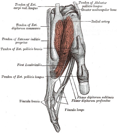
It's hard to imagine that any text description alone could be as understandable as text supplemented by illustrations. In this case, a picture is worth 10,000 words, at least. Illustrations, maps, charts, etc. can enhance comprehension, especially for those with cognitive and learning disabilities.
Animations
Animations on web pages rarely enhance accessibility. Most of the time they are simply annoying and distracting. Ads often animate to distract us from the main purpose of a web page.
Well-designed animations can, however, be used to enhance content by presenting media content or by focusing attention on important content. An animated graphic may present a sequence of images that convey content that cannot adequately be presented by one static image. Highlighting or other animations can focus the user on important content, such as error messages or required inputs. When one of the "Article Contents" links at the top of this page is activated, an animation briefly highlights the target content area to help draw visual attention to it.
Animation should almost always be user controlled or very short in duration. Images that continually animate can cause the rest of the page to be more difficult, or for users with very high levels of distractibility, totally inaccessible.
WCAG 2 Success Criterion 2.2.2 (Level A) requires that automatically moving, blinking, or scrolling content that lasts longer than 5 seconds can be paused, stopped, or hidden by the user. Common failures include carousels or sliders that automatically animate or cycle through content.
Icons
![]() Many web pages use icons to supplement or replace text. Complex content and functions, such as clicking a gear icon for "settings", can easily be conveyed through a very small icon. Icons should be simple, easy to understand, and consistent. Icons almost always require familiarity in order to be useful. Across cultures and languages, they can be misinterpreted. In many cases, adjacent text is helpful.
Many web pages use icons to supplement or replace text. Complex content and functions, such as clicking a gear icon for "settings", can easily be conveyed through a very small icon. Icons should be simple, easy to understand, and consistent. Icons almost always require familiarity in order to be useful. Across cultures and languages, they can be misinterpreted. In many cases, adjacent text is helpful.
![]() In this example, since the adjacent text conveys the content of the icons (and is presumably contained within the same link as the icons), the icons should have
In this example, since the adjacent text conveys the content of the icons (and is presumably contained within the same link as the icons), the icons should have alt="" so they are not identified separately.
Color Reliance
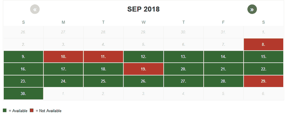
Color must not be used as the sole means of conveying meaning. This example illustrates a calendar for making tour reservations. Green indicates dates that are available, while red indicates dates that are not available. A user who can perceive colors will have no trouble distinguishing between them. However, a user who cannot perceive color well, due to color-blindness or low vision, will probably not be able to distinguish the difference as easily. Moreover, a user might choose to override page colors to a high-contrast mode they require. Also, since users who are blind are also color-blind, the calendar colors will be meaningless to them as well.
Ensure that no meaning is lost when colors are removed, even within images. Tools such as Vischeck or WAVE can remove all page color and simulate color-blindness.
Contrast
Images that convey text must present that text with sufficient contrast. Text contrast within images is particularly important if the image is of low quality or when the image is enlarged.
WCAG 2 sets minimal contrast thresholds for text and images of text. Testing text contrast within images can be difficult since the RGB color values are not defined in code. We recommend using an “eyedropper” utility in your browser to detect the colors and then running them through the WebAIM Contrast Checker.
Non-text Contrast
![]() When elements other than text convey meaning, the perceivability of these elements is just as important as the perceivability of text.
When elements other than text convey meaning, the perceivability of these elements is just as important as the perceivability of text.
For this reason, WCAG 2.1 Success Criterion 1.4.11 (Level AA) requires that graphical objects and author-customized interface components have a contrast ratio of at least 3:1. This applies to elements such as
- icons
- components of charts and graphs
- buttons
- form controls
- focus indicators and outlines
![]() This contrast requirement applies to graphical content that is required for understanding—icons, charts, graphs, etc. In this illustration, since the icons are accompanied by contrast-conformant text, the 3:1 requirement for the icon does not apply. The text (which must meet the 4.5:1 contrast requirement for text) is conveying the meaning and the icons are just enhancements.
This contrast requirement applies to graphical content that is required for understanding—icons, charts, graphs, etc. In this illustration, since the icons are accompanied by contrast-conformant text, the 3:1 requirement for the icon does not apply. The text (which must meet the 4.5:1 contrast requirement for text) is conveying the meaning and the icons are just enhancements.
Pixelation of Enlarged Images
When users zoom the browser or use screen magnifier software, images can lose fidelity and become pixelated.

True text scales smoothly to any zoom level and would have been much clearer in this example.
Lorem Ipsum
Although text in images is sometimes unavoidable, true text should be used whenever possible. CSS can apply custom fonts, colors, gradients, and shadows to true text. True text also uses less bandwidth, supports translation, is searchable, and is easier to maintain and customize.
WCAG 2 Success Criterion 1.4.5 (Level AA) requires that images not be used to present text, if true text can achieve the same visual presentation. Logos are exempt.
Graphics That Cause Seizures
Bright, strobing images or media can cause seizures in some people. Seizures can be dangerous, even life-threatening. Don't be responsible for causing them.
In order to potentially trigger a seizure in a user with photosensitive epilepsy, a flashing image or multimedia must:
- flash more than 3 times per second,
- be sufficiently large (a very small flashing image, such as a cursor, will not cause a seizure), and
- be bright, with significant contrast between flashes.
Additionally, the color red is more likely to cause a seizure. While large, flashing images are rare on the web, seizure-inducing media is more common in web video, especially HD-quality video that includes strobing special effects. Such media must be avoided!
WCAG 2 Success Criterion 2.3.1 (Level A) defines thresholds for frequency, size, contrast, and color of strobing images.