Visual Disabilities
Color-blindness
Types of Color-blindness
 Color-blindness or color vision deficiency is the inability to distinguish certain shades of color. It is a fascinating topic because of its complexity. The human eye has three types of photoreceptors, each of which is responsible for detecting different color wavelengths. Additionally, photoreceptors called rods detect light intensity. Color-blindness can occur if any of these types of photoreceptors is missing or functioning incorrectly.
Color deficiency makes certain color combinations difficult to differentiate. The colors with which they have difficulty distinguishing depend upon their type of color-blindness, but red-green deficiencies are the most common, meaning that certain shades of the colors red and green may appear very similar.
Red-green deficiencies
Individuals with a red-green deficiency have difficulty distinguishing between some shades of reds and greens, but they can still differentiate between a light color and a dark color. A dark red and a light green will be easy to distinguish because of their luminance difference. People with red-green color-blindness may see reds and greens as yellows, oranges, and beiges. This means that yellows, oranges, and beiges can be confused with greens and reds. Blue is not affected by this type of color blindness.
Protanopia and protanomaly (red deficiencies)
Protanopia and protanomaly occur when the cones in the eye primarily responsible for detecting red are missing or malfunctioning. The greens tend to look like the reds. Protanomaly is milder than protanopia, but the result is similar. Many people with protanomaly can distinguish some reds and greens with some difficulty, and, as with protanopia, reds tend to look darker as well.
Normal

Protanopia

Deuteranopia and deuteranomaly (green deficiencies)
Deuteranopia and deuteranomaly occur when the cones primarily responsible for detecting green are missing or malfunctioning, but the result is very similar to protanopia, with the exception that reds do not appear as dark. Deuteranomaly is the less serious of the two conditions. Individuals with deuteranomaly can often distinguish between the shades of reds and greens relatively accurately.
Normal
Deuteranopia

Other deficiencies
Tritanopia and tritanomaly (blue deficiencies)
Tritanopia and tritanomaly are much less common than the other types. Tritanopia is when the cones primarily responsible for detecting blue are missing or malfunctioning. Blues and greens may appear very similar, and yellows may appear as lighter shades of red or may seem to disappear completely.
Normal
Tritanopia

Rod monochromacy or achromatopsia (no color)
This group constitutes an extremely small minority among people who are color-blind. All three types of cones or either missing or non-functional, so the rods (the photoreceptors which can only differentiate between light and dark) are the only available source of visual information. Individuals with achromatopsia (or achromacy) see the world as if in grayscale—everything will appear in black, white, and shades of gray. This often creates poor visual acuity and an aversion to bright light.
The term "color blindness" is most true for this type of deficiency, since these individuals entirely lack the ability to see any color, whereas the term "color vision deficiency" is most accurate when people only lack part of the color spectrum.
Normal
achromatopsia

Designing for Color-blindness
When designing web content, it is not necessary to get rid of color. It is not necessary to convert all images to black and white or get rid of images entirely. In fact, it may not be necessary to change anything at all.
Make sure that colors are not the only method of conveying important information.
Most of the time, color is irrelevant in understanding content on the web. However, when colors are used to convey or differentiate information—such as a pie chart or bar graph, or using green and red text to indicate pass/fail or good/bad, etc.—this information should also be provided in another way. Consider also that anyone who is blind, is also color blind.
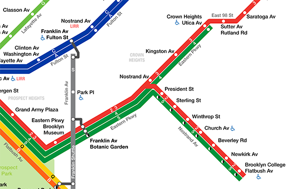
For example, the image below shows a portion of the New York City public transportation system, where the routes are distinguished by the color of the lines.
When color information is removed, the routes are very difficult to differentiate.
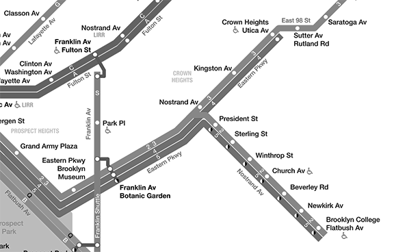
Color enhances the user experience. However, when colors are not perceived by users who are blind or color-blind, are overridden by custom settings, or are not readily distinguishable, this information would need to be conveyed by annotating the image, using different styles or contrasts for each line, or by supplementing the image with text on the web page that conveys the same information.