When WebAIM evaluates a client’s website for accessibility, we often spend more time evaluating and reporting on ARIA use than any other issue. Almost every report we write includes a section cautioning against ARIA abuse and outlining ARIA uses that need to be corrected or, most often, removed. Ironically, this is often followed by a list of issues that can only be addressed with ARIA.
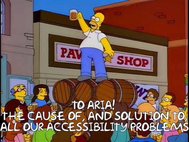
Like many adults who were teenagers in the ’90s, I can think of a Simpsons quote to fit just about any situation. In one popular episode, Homer holds up a mug of beer and proposes a toast "To alcohol: the cause of, and solution to, all of life’s problems." With just a bit of tweaking, this quote represents my feelings about ARIA.
Every ARIA role, state, or property can enhance accessibility when used correctly, and vice versa. However, after looking at hundreds of real-world ARIA uses and abuses, it is clear that some ARIA attributes are typically used in ways that cause more problems than they solve, while other attributes should be used more often to solve specific problems. Here are a few of the most common ARIA attributes from each category:
The cause of…
Most problematic ARIA attributes share a similar problem—they are often used to override correct HTML semantics and thus present incorrect information or interactions to screen reader users. For example:
role="menu"
This is probably the worst offender. ARIA role="menu"(or menubar) is not a simple collection of links at the top of the page. It is a software-like list of choices where arrow keys are used to navigate the menu and submenus. Most of the ‘menus’ that I encounter should probably be marked up with <nav> (or role="navigation"), and nothing else.
role="grid"
A grid should be navigated with the arrow keys, like a spreadsheet. It should not be used on a simple data table or a grid of items that are navigated with the Tab key. Adding this role to a data table can render the table contents very inaccessible to screen reader users.
role="toolbar"
This is meant to be navigated with arrow keys, not the Tab key, and is reserved for complex application toolbars, not basic groups of links or buttons. There seems to be a pattern here…
role="application"
Like the previous three roles, this causes a Windows screen reader to switch from Read/Browse mode to Forms/Focus mode. However, it is seldom necessary except for on very complex widgets where advanced keyboard interactions are necessary. Most interactions can be addressed using native form controls or by using ARIA roles that have well-defined design patterns.
role="heading"
A true heading (<h1>–<h6>) can almost always be used instead. If this role is used correctly, it should also have an appropriate aria-level, but in the real world this is often missing.
role="alert"
This should be used for important messages that should be read by a screen reader as soon as they appear. ARIA alerts can be useful when implemented correctly, but there are so many ways an alert can go wrong. A few examples:
- A hidden element has
role="alert"applied when the page loads, so the screen reader reads the alert immediately (even if it is visually hidden) instead of reading it when it appears. - Focus is set to the alert when it appears, so it is read twice (once because it is an alert and again because it has focus).
- ARIA alerts are triggered repeatedly, overwhelming a screen reader user.
role="button"
When used correctly, it can tell a screen reader that an element functions like a button, but this role is often used extraneously (<button role="button">), or used where a true button should be used instead. I also see it used with elements that do not function as buttons. For example, if a link is given role="button", JAWS will tell the user to activate the button with Spacebar, but links can only be activated with Enter. This would then require key event detection to ensure that pressing the Spacebar will activate the "button".
aria-label
This can be an effective way to label form controls that don’t have text labels, or to provide alternative text for interactive elements that use icon fonts and CSS background images. However, aria-label can also override other important information such as link text. It is often used excessively, or to present special screen reader-only information, which creates an inconsistent experience for screen reader users. Additionally, because there is no visual indication that it is in use, it is often overlooked in testing. I have seen countless examples where an ARIA label is just plain wrong.
The solution to…
There are some ARIA attributes that we often recommend be used more often. Most of these fill a notable gap in HTML semantics.
aria-expanded
This can tell screen reader users that activating a button or link will cause content to expand and collapse below (e.g., an accordion), and also whether it is currently collapsed or expanded.
aria-haspopup
This attribute lets a screen reader user know that a button or link will cause something to pop up. ARIA 1.0 states that this is to be used with menus and submenus that pop up, and we definitely recommend its use in these cases. It was often used for other types of pop-up, so ARIA 1.1 has expanded its use to include a few other pop-up types (most notably aria-haspopup="dialog"), but its support is still limited.
aria-describedby
The aria-describedby attribute associates descriptions to form controls and other interactive elements. It will not override the form label, link text, or alternative text, so when it is misapplied the impact is usually less significant.
aria-labelledby
This attribute can be used to provide multiple labels to a single form control, among other things. It has some of the dangers of aria-label, like overriding link text. However, since it is used with text that appears within the page, it is not abused nearly as often.
aria-pressed
This can be useful to identify the status of toggle buttons that can be pressed and unpressed, such as a mute button in a video player.
role="switch"
Since on/off or toggle switches are becoming much more common on websites, ARIA 1.1 includes a new role to identify this type of interaction. Support is still inconsistent, but the fallback of a correctly-implemented ARIA switch should be a checkbox, which is an acceptable fallback until support improves.
role="presentation"
This role will essentially remove the default semantics from an element. It is useful in hiding layout tables from screen readers.
The cause of, and solution to…
I often find myself encouraging correct use and discouraging incorrect use of the following ARIA markup:
role="dialog"
This attribute is going through some growing pains. ARIA 1.0 gave a very specific definition for dialogs. Roughly paraphrasing, a dialog was defined as a window that interrupts a process and requires a response, but many people used this role for other types of dialogs outside the original scope. ARIA 1.1 has a broadened the definition for dialog: "A descendant window of the primary window of a web application." It also has new attributes of aria-haspopup="dialog", and aria-modal="true" that can further enhance the accessibility of dialogs. However, support of these new attributes is still lacking, and the current implementation of role="dialog" can be confusing and inconsistent. It also causes reading problems in the NVDA screen reader (although this should change in the future). For that reason, I struggle with the best use of this role, and our recommendations can vary based on the implementation and timelines of specific clients.
role="tablist"
A group of tabs can present a great deal of important information: selecting a tab will change the section of content that follows, which tab is currently selected, how many tabs are available, etc. ARIA tabs present this same information to screen reader users when implemented correctly, but they cause more problems than they solve if they are implemented incorrectly or incompletely.
tabindex="0"
While tabindex is not technically an ARIA attribute, it goes hand-in-hand with ARIA. Used correctly, it allows elements that are not "focusable" (e.g., <div>s) to receive keyboard focus. When implemented, additional techniques are necessary, such as giving the element an appropriate role and using scripting to trigger the element’s functionality when Enter and/or Space key events are detected. However, tabindex="0" is often used with elements that are not "actionable", meaning the user can navigate to it with a keyboard but cannot interact with the element. For example, important instructions in a form may be given tabindex="0" so that a screen reader user will discover them while navigating with the Tab key, but a better technique may be to associate these instructions to a form control with aria-describedby, or to restructure the form so the instructions are presented at the beginning.
tabindex="-1"
This can be used to set "programmatic" focus to something that otherwise cannot receive focus, meaning the user will skip over it when pressing the Tab key, but focus can be set to it through scripting or a link. This is sometimes used without consideration that a link or control with tabindex="-1" will no longer be keyboard accessible.
Landmarks and HTML5 regions
These can enhance orientation and navigation when used appropriately. At the very least, most sites should have a <header>, <nav>, <main>, and <footer>. Used incorrectly or excessively (and they often are), landmarks create more noise than help. Two regions/landmarks that are also often overused are: <nav>/role="navigation" and <header> (the ARIA equivalent—role="banner"—does not seem to be overused as often as <header>).
ARIA Design Patterns to the rescue
If you are in doubt regarding the appropriate implementation of ARIA, the first place to look is the WAI-ARIA Authoring Practices document, especially the section on Design Patterns and Widgets. This section outlines the correct patterns for over 20 common ARIA widgets. Each widget has the following information.
- A description of the correct widget type. Does the element that you are creating match the widget description in this section? If it does not, maybe you should be using different ARIA attributes, or no ARIA at all. Or maybe you should change the widget you are building so it aligns with the definition.
- Keyboard interaction. This section will identify required and optional keystrokes. For example, if you are creating a slider, users must be able to increase and decrease the value with the up/down and left/right arrow keys, not one set or the other. The Home and End keys must also set the slider value to the beginning and end. Page Up/Page Down may optionally be programmed to jump by a larger value (e.g., by 10).
- The correct ARIA roles, states, and properties. Like the keyboard controls, it will identify required and optional ARIA attributes for the widget. For example, a slider needs roles of
slider,aria-valuenow,aria-valuemin, andaria-valuemax. Other values such asaria-valuetextandaria-orientationmay be necessary for some sliders. A label will also need to be provided througharia-labelledbyoraria-label. - Examples. For many, but not all of the widgets, working examples are provided. Unfortunately, there are many incorrect ARIA examples found online, so it is often best to start with the examples provided in the WAI-ARIA Authoring Practices document.
If a developer would refer to this document before adding ARIA to their pages, many ARIA accessibility problems could be avoided, and ARIA solutions would increase.
I notice that people misuse “aria-expanded” often, putting it on the expanded area rather than the button that is expanding it.