In the early years of Microsoft Office, support for screen reader users was limited, and in most cases required third-party software and workarounds. In Office 2007, the Ribbon interface was introduced. This “Fluent UI” was a boon to productivity for some users, but it initially posed significant challenges for screen reader users. To its credit, Microsoft moved quickly to develop keyboard shortcuts and other navigational aids to provide a more equivalent experience.
Microsoft continued to improve support for screen readers users in Office 2010. It also introduced the Accessibility Checker, which may have been the first time many users were aware of Microsoft’s focus on accessibility. In Office 2013, support for screen reader users continued to grow, and improvements were made to the Accessibility Checker. In Office 2016, a significant development was providing users with the ability to mark images as “decorative.”
While Microsoft’s ongoing efforts to focus on accessibility are to be commended, for many years there have been signs that increasing accessibility was not a comprehensive effort across the product team. When compared with the inherent focus on accessibility of the Accessibility Checker, accessibility updates to other parts of Office since the checker’s introduction suggested a “siloed” approach for the product as a whole.
Let’s review two missed opportunities with a specific user interface–the color picker. Then we’ll examine how the new color picker signals an evolution to a more comprehensive approach.
Content should be accessible by default
When creating software applications, developers are often admonished to “Save users from themselves.” In the context of accessibility in content authoring software, this could be restated as “Don’t set users up to create content that is inaccessible by default.” Unfortunately, the color picker in Office is a long-standing non-example of this principle.
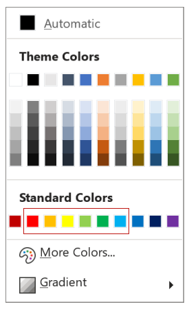
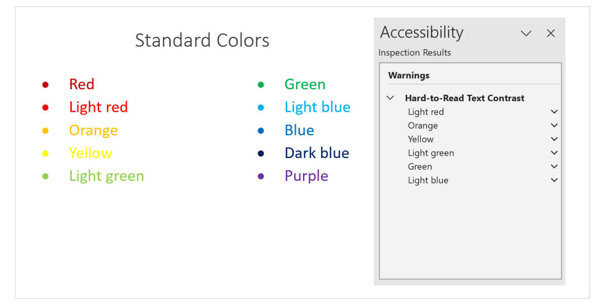
When Microsoft changed the “Standard Colors” on the picker in 2016, one might have expected that the colors in this new palette would have been chosen to create text that would meet contrast requirements by default, yet six of the ten colors had insufficient contrast with a white background.
Then, when a check for “Hard-to-Read Text Contrast” was added in Office 365, these colors were not changed, despite text created with the standard colors being identified as an issue by the Accessibility Checker itself.
The fact that the standard colors were not modified at this time suggests an uneven approach to accessibility.
A more comprehensive approach to accessibility
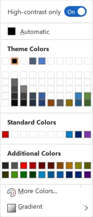
A recent development appears to signal a shift in Microsoft’s approach. Announced as part of the launch of the Accessibility Assistant in March of this year, a new color picker is now available (on a limited basis as of this writing). This picker has a “High-contrast only” toggle switch. When enabled, the standard and theme colors that would result in insufficient contrast with a white background are hidden.
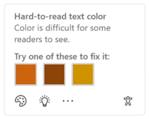
Further evidence of a more global integration of accessibility into Office is the upcoming introduction of contextual flagging of contrast issues—directly on Word documents. When “hard-to-read text color” is identified, an accessibility icon is displayed in the document’s margin. Clicking the icon identifies the accessibility issue, and even provides alternative color values with sufficient contrast.
My takeaways
I’m encouraged as I learn more about these recent developments that are evidence of Microsoft following its stated philosophy: “The best way to solve an issue is to prevent it from happening in the first place.” As a developer and designer I believe that software applications have an opportunity and an obligation to assist users in creating content that is optimized to be as accessible as possible. As a trainer and a training course designer, I look forward to helping future cohorts of learners to implement these new resources into their process for optimizing accessibility in Office.
Thanks for this. It is encouarging to see this evolution. I look forward to the day that Microsoft incorporates it just like they do spellcheck or grammar checkers.
Accessibility errors are bugs, and get in the way of communications. We need to find more ways to just normalize the process of creating inclusive content.
This looks like a great addition to their accessibility improvements – thanks for drawing attention to it!
Thanks for this great information, George. We will be watching out for the color picker upgrade and trying it out. Love trying to prevent issues instead of fixing them – but we are where we are so new/better tools are greatly appreciated.
Hi Chris,
Information provided during an excellent presentation at Accessing Higher Ground 2023–Microsoft vs Google: A Comparison of Accessibility Features in Documents and Slides–confirms what you are experiencing. This information is shared on slide 62 of the presentation slides.