Usable and Accessible Form Validation and Error Recovery
Introduction
Form validation ensures that web forms are filled out with all necessary information in the correct format. Error recovery guides a user to fix missing or improperly formatted information if detected. Form validation and error recovery can be implemented in a variety of ways, primarily either:
- server-side—the form information is submitted and analyzed by the web server, and necessary feedback messages are written to a newly generated web page
- client-side—form validation and error recovery are performed within the web client or browser using JavaScript and generated within the web page.
Advantages of server-side validation and error recovery include:
- The form can be completed and submitted without interruption from validation alerts, errors, or warnings.
- The user does not need to have scripting enabled in their browser.
- Validation mechanisms are more difficult to bypass or modify, making it more secure.
Advantages of client-side validation and error recovery:
- Validation can occur in real time, before the user submits the form data to the server.
- Functionality does not require server-side scripting.
Some users may disable scripting in their browser. As such, developers should not require client-side scripting in order for the web form to be accurately completed and submitted. Additionally, any client-side validation or information can easily be modified or disabled within the browser. For best results, developers can utilize both server-side and client-side validation and error recovery to provide both efficiency and security.
Building Usable Forms
Creating a user-friendly and accessible form is an important first step to ensure that a user completes the form correctly. This can be accomplished by:
- providing all necessary instructions and cues.
- associating form controls with a text label by using the label element.
- implementing fieldset and legend elements to associate groups of checkboxes and radio buttons.
- ensuring that the reading and navigation order is logical.
- ensuring that the form can be completed and submitted using a keyboard.
- testing that the form controls, labels, and functionality are understandable and usable.
When specific inputs must be completed or selected in the form, these should be identified in a usable, accessible, and apparent manner. Using the appropriate input type, such as <input type="tel"> for telephone numbers, <input type="number"> for numeric inputs, etc., can facilitate proper input and browser-generated error feedback.
Instructions should typically be located adjacent to the required form control and within its associated label. Because screen reader users may navigate from form control to form control rather than line by line, placing this important information within the label allows the screen reader to read it when the control receives focus. The label should be adequately descriptive and also be visually apparent.
<label for="firstname">First Name

	<span style="color:red">(required)</span></label><br>

	<input type="text" name="firstname" id="firstname">
displays as:
The aria-required="true" or required attribute can be used to identify required fields to screen reader users, especially if the label text does not indicate this or if color-alone or an asterisk are used to identify the required fields.
If the form input requires a specific format, adequate instructions must be provided within the label or other associated content (such as with aria-describedby). In many cases, developers can simplify their forms by not requiring a specific formatting. If a precise format (such as for telephone numbers) is required for entry into a database, for example, coding can often be used to reformat the user-entered information to match the required format, thus removing this burden from the user.
Hiding Form Labels
There are a number of ways to create visually hidden form labels. However, it is important to consider why the information would not be useful or necessary visually when it is important to the screen reader user. Visually hiding form labels also removes some functionality from the page—users can click on the form labels to immediately access or activate the form control with which the label is associated. This can be especially helpful for users with some types of motor disabilities.
Form Validation
Form validation itself is usually performed behind the scenes and does not typically pose accessibility issues as long as the method to invoke the form validation mechanism is accessible. This means that the validation and submission process must be available when using both the mouse and keyboard.
The form must also submit to the server if client-side scripting is unavailable. Forms that rely solely on script functions or event handlers should be avoided. Instead, use a true URL action value for the form. Client-side validation can still be invoked, and it would be processed first if scripting is enabled.
Error Recovery
If either client-side or server-side validation detects errors in the form, then there is a 3-step process to ensure usable and accessible error recovery:
- Alert the user to the presence of the error in an apparent and accessible manner.
- Allow the user to easily access the form controls that need to be modified.
- Allow resubmission and revalidation of the form.
There are three primary approaches to meet these requirements, described below as:
- Error alert, then focus
- Errors on top
- Inline errors
Each approach has pros and cons and might be optimal based on the content, layout, and complexity of the form.
Error alert, then focus
The first step is to inform the user that an error is present. This error message should be visible, informative, and directly accessible. One way to accomplish this is to use a JavaScript alert box—the browser provides a highly accessible alert. An alternative is to provide a custom modal dialog to inform the user of the error, though custom dialogs require much more effort to ensure accessibility.
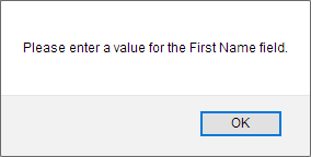
The advantage to the "Alert, then focus" approach is that users are informed of errors immediately and can then easily resolve the issue directly. The primary disadvantage is that only one error is indicated and addressed at a time.
Errors on top
The error message can also be written to the web page itself. When client-side scripting is available, the error message can be written to the page before the form is submitted. With server-side scripting, the form page is typically regenerated to include the original form with the appropriate message.
The "Errors on top" approach displays the error message above the form. When presented, focus should be set to this error message to allow screen reader and keyboard users to immediately access the error message without having to find it amongst the rest of the page contents. Focus can be set to the message with client-side scripting using JavaScript focus(), or the server-generated page can include an anchor name in the URL (e.g., http://myserver.com/form.php#errormessage) which will set focus directly to the error message element if given the matching id attribute value (e.g., <p id="errormessage">).
The error message should clearly describe the errors presented and how to fix them. For example, "Course number is not valid" is not as helpful as "Course number must be a 3 digit number". It may be helpful to inform the user how many errors were detected.
Once the user has been presented with the error message, a mechanism should be provided to quickly access the form input(s) that must be remedied. A link may be provided within the error message to set focus to the appropriate form control.
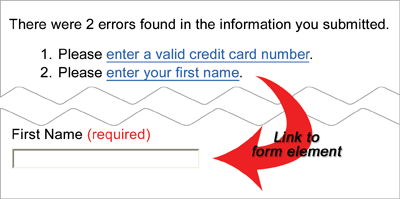
The advantage of the "Errors on top" approach is that all errors are presented together. The disadvantage is that if there are a lot of errors, it can be difficult for the user to remember, find, and address all of them.
Inline errors
Another approach is to display the error messages within the form in the context of the form control that needs attention. This approach requires visually distinctive error messages so visual focus is drawn immediately to them. The error messages must be associated to their respective controls (via labeling or aria-describedby). It is typically best to set focus to the first control that needs attention.
The advantage to the "Inline errors" approach is that the errors appear in context with their respective controls. The disadvantage is that the user must visually scan or navigate through the form to discover the invalid controls and their respective error messages. This can take some time.
A combination of "Errors on top" and "Inline errors" techniques can often be optimal because it benefits from the advantages of both approaches while minimizing the disadvantages.
aria-invalid
Regardless of the mechanism used to identify and recover from form errors, aria-invalid="true" should generally be set on each invalid form control. This attribute causes screen readers to identify the control as being "invalid" or in need of attention.
Summary
In all cases, careful user testing can usually highlight difficulties or problems in form usability, validation, and error recovery mechanisms. While there are many methods available to ensure form usability and validation, and accessible, user-friendly error recovery, the following general principles should be applied:
- Build forms that are easy to use and intuitive, providing all necessary instructions, cues, and prompts.
- Ensure the forms are keyboard accessible.
- Associate form
<label>elements with form controls. - Use fieldsets and legends to associate groups of checkboxes and radio buttons.
- Include necessary instructions within form
<label>elements (e.g., required or specially formatted controls) - Do not rely on JavaScript alone for form submission, validation, and error recovery.
- Alert the user of any validation errors in an apparent and accessible manner with informative feedback messages.
- Allow the user to easily access the form controls that need to be modified.
- Allow resubmission and revalidation of the form information.