Contrast and Color Accessibility
Evaluating Contrast with Chrome DevTools
Introduction
There is no one-size-fits-all tool for testing all contrast issues, but Chrome Developer Tools (or DevTools) is the most full-featured tool for manually testing contrast within a webpage. DevTools is included with Chrome and is very useful for evaluating and debugging a webpage within the browser. It is full of features, but this article will focus only on the those that are necessary to evaluate contrast.
While many of the features within Chrome DevTools are keyboard accessible, the color picker used in the contrast checker is not. See Google's Keyboard Shortcuts Reference for details on using DevTools with a keyboard.
Evaluating Contrast
To evaluate contrast using Chrome DevTools, the element you want to review and select . Find the pane in the DevTools window. This is the area where you will find colors and test contrast.
If the Styles pane is not visible, press F1 to open the tool preferences, then select .
We are looking for color style definitions, but it can sometimes be hard to figure out which CSS rule determines the final color because the styles that make up an element usually come from different places, even different files. Combining and overriding of rules in this way is the "Cascading" in "Cascading Style Sheets" (CSS). If there are two color rules that conflict—for example, an element is defined with gray text in one CSS rule and blue text in another—there is an algorithm that dictates which style will be applied.
The Styles pane shows all the styles applied to the inspected element. There is also a section that shows the "computed" styles, or final styles applied to the element after all the rules are combined by the browser. If the DevTools window is docked to the side of the screen, the computed styles will appear in the right side of the pane.
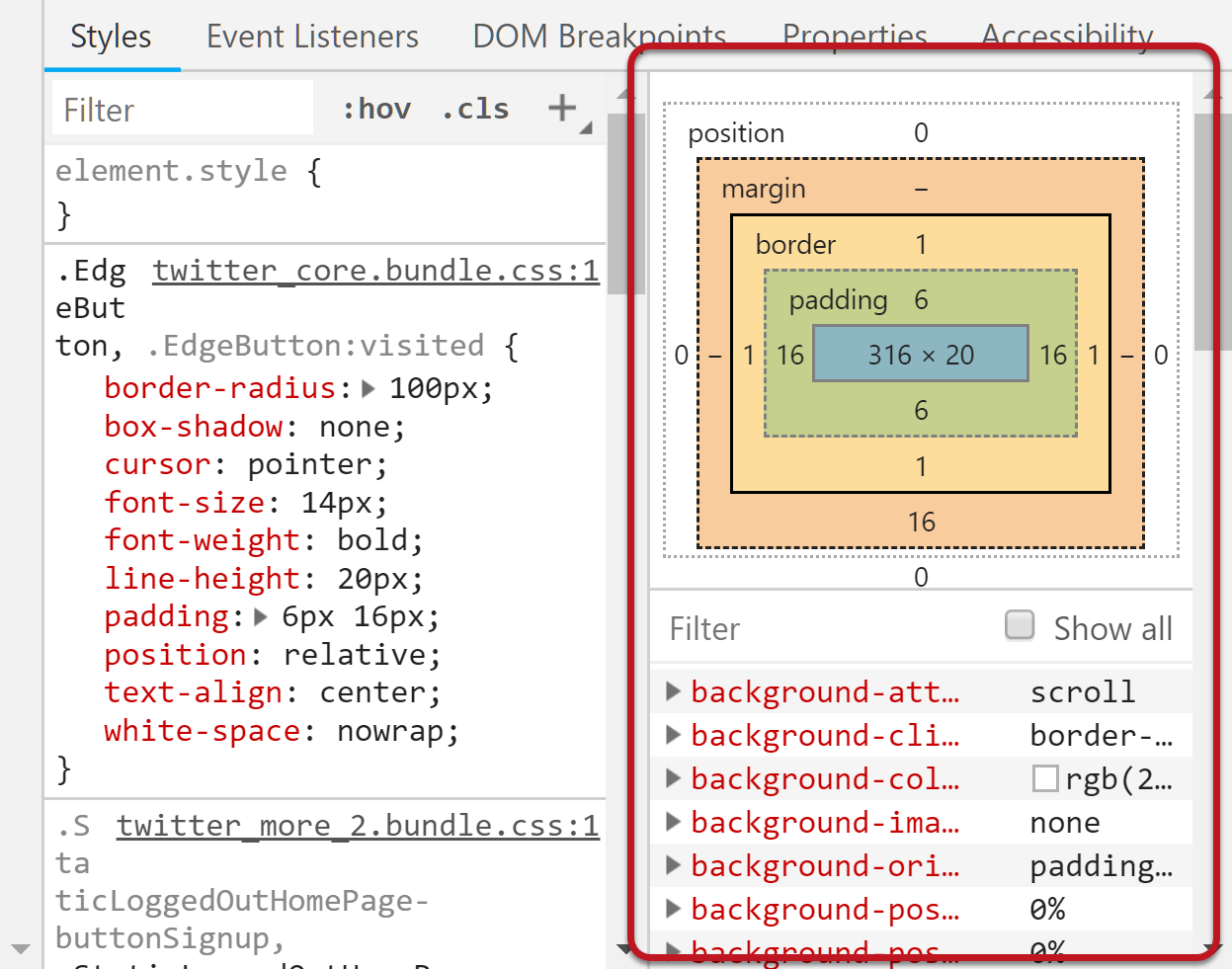
If you have the window docked to the bottom or in a separate screen, it will show up when you click the tab, next to the tab.
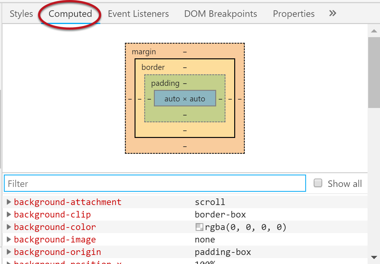
This is where we want to start. Look for the word "color" in the list of computed properties (they are listed alphabetically). You can also filter to all color style definitions by entering "color" in the Filter box at the top. The word "color" will be followed by a small box that shows the element's text color. Hovering over this box with a mouse causes a small arrow to appear.
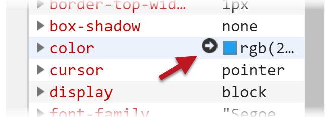
Clicking this arrow will briefly highlight the line of CSS in the Styles pane that defines the color for this element. This CSS line will also have a box that shows the text color. Click on this box to open a dialog where you can change the element's current color using a color gradient or other color-picking tools. This dialog also displays the contrast ratio followed by one of three icons: two green checkmarks the colors pass enhanced AAA contrast requirements, a single green checkmark if they pass only AA, or a red failure icon if the colors fail AA.
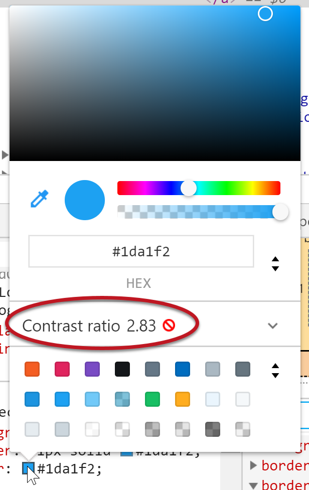
The Contrast Ratio section can be expanded to show the contrast level you must meet – 4.5:1 for AA or 3:1 for large text. If you do not see the contrast ratio, this is probably because the element does not have a defined background color. You can use the eyedropper tool to choose the background color from within the page or to pick a different background color from the page. This is very useful if you have a background that is an image, gradient, etc.
A white line will also appear within the color gradient at the top of the dialog. This shows the necessary contrast threshold—any color on one side of this line will meet AA contrast requirements and any color on the other side will fail AA.
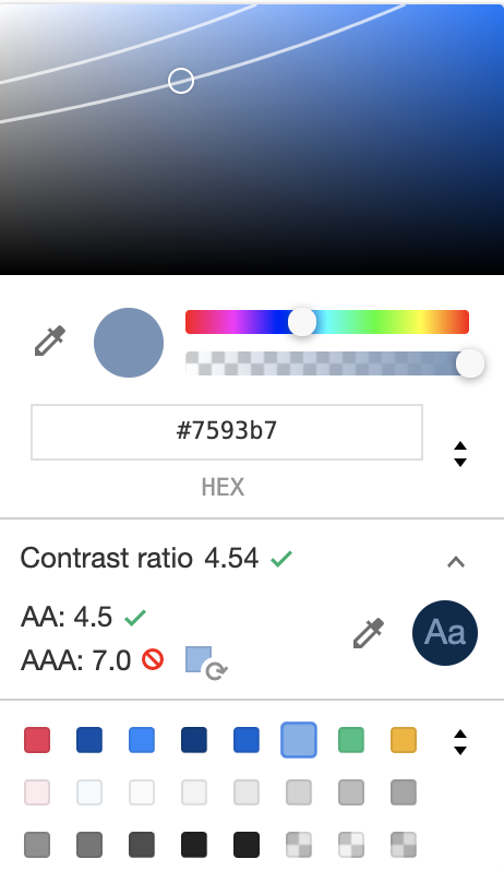
If you click in the gradient area to select a new color, the contrast ratio will update, and the new color will appear in the webpage (until you close DevTools or reload the page).
Checking Hover and Focus States
DevTools can also be used to test the contrast of various states of interactive elements like links and buttons. Toward the top of the pane is a button. Selecting this button will reveal several possible states for the element. The two most important options are and . Selecting one of these options will force this state change to persist until you de-select the option, close DevTools, or reload the webpage.
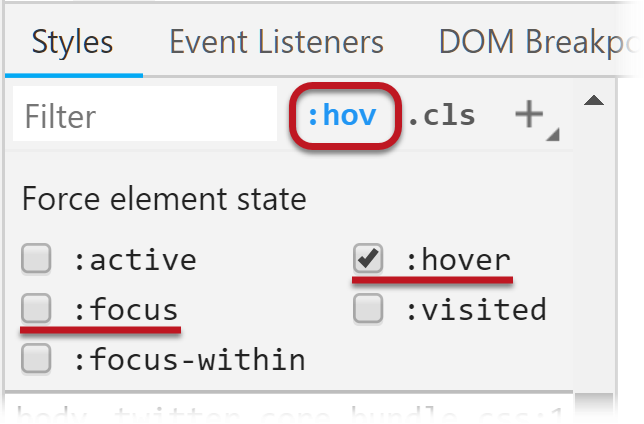
With :hover activated, you can inspect the contrast for this element in the hover state. The same applies to :focus. If the background color changes in this state or is not properly detected, as above, use the eyedropper tool to select the correct background color from the page.
The contrast checker is only available for the "color:" property. While you can use DevTools to find the color styles for borders, outlines, etc., you will need to use other contrast tools to determine their contrast ratio.