Contrast and Color Accessibility
Understanding WCAG 2 Contrast and Color Requirements
Introduction
Contrast and color use are vital to accessibility. Users, including users with visual disabilities, must be able to perceive content on the page. There is a great deal of fine print and complexity within the Web Content Accessibility Guidelines (WCAG) 2 that can easily confuse web content creators and web accessibility evaluators. This article pulls together the terms and principles needed to understand WCAG 2 requirements for contrast and color.
Defining Colors
Colors can be defined in a few ways. For example, this shade of blue may commonly be defined in three different ways in webpage styles:
rgb (97, 97, 255): The amount of red, green, and blue that form a color are each presented as a number between 0 and 255.#6161FF: This is a "hexadecimal" format where the red/green/blue values are presented as a combination of six letters or numbers. Typically called "Hex," this is a very common format in webpages.hsl (240, 100%, 69%): Hue, saturation, and lightness map more closely to the way people perceive colors. Changing the "lightness" of a color will change its contrast ratio to another color.
Alpha, which is the opacity or transparency of a color, will also impact contrast. Alpha is presented as a number between 0 (completely transparent) and 1 (completely opaque). Reducing the alpha for an element will reduce its contrast because you are allowing an underlying color to bleed through.
WCAG 2 "Contrast Ratio"
In WCAG 2, contrast is a measure of the difference in perceived "luminance" or brightness between two colors (the phrase "color contrast" is never used in WCAG). This brightness difference is expressed as a ratio ranging from 1:1 (e.g. white on white) to 21:1 (e.g., black on a white). To give a frame of reference, on a white background:
- Pure red (#FF0000) has a ratio of 4:1. I am red text.
- Pure green (#00FF00) has a very low ratio of 1.4:1. I am green text.
- Pure blue (#000FF) has a contrast ratio of 8.6:1.I am blue text.
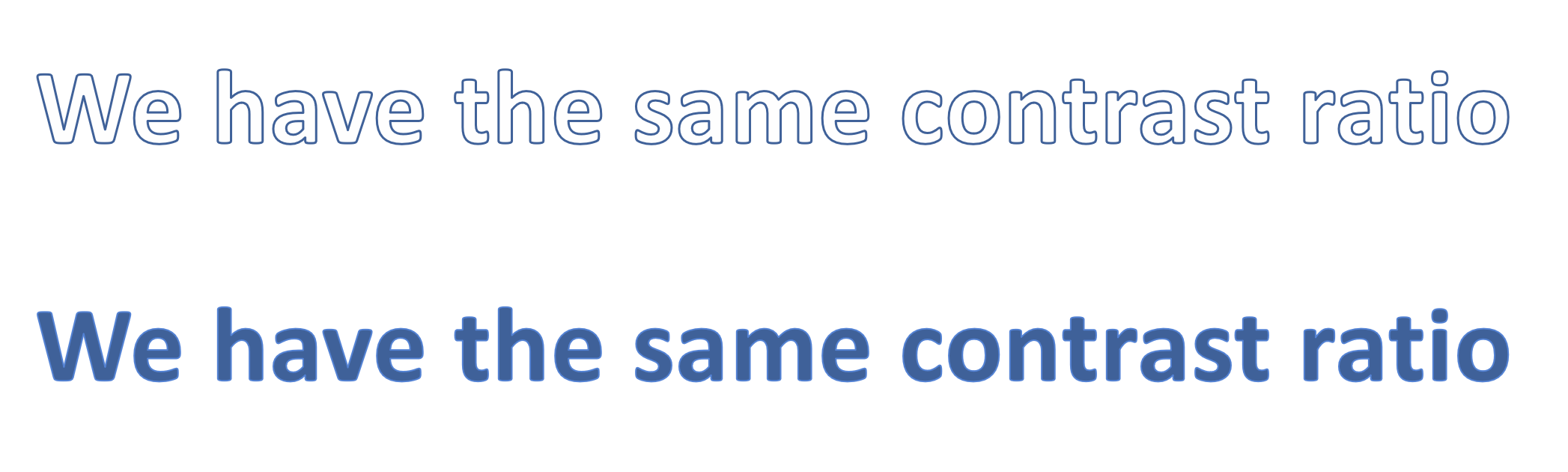
If text and background colors are swapped, the contrast ratio remains the same.
Three success criteria in WCAG 2 address contrast:
One additional success criterion, 1.4.1 Use of Color, references the contrast ratio as part of the requirement for links that are differentiated by color alone.
We will review these four success criteria in detail.
1.4.3 Contrast (Minimum)
This Level AA requirement reads:
The visual presentation of text and images of text has a contrast ratio of at least 4.5:1, except for the following:
- Large Text: Large-scale text and images of large-scale text have a contrast ratio of at least 3:1;
- Incidental: Text or images of text that are part of an inactive user interface component, that are pure decoration, that are not visible to anyone, or that are part of a picture that contains significant other visual content, have no contrast requirement.
- Logotypes: Text that is part of a logo or brand name has no contrast requirement.
Here are some examples of text with almost exactly 4.5:1 contrast.
- Gray (#767676) on white
- Purple (#CC21CC) white
- Blue (#000063) on gray (#808080)
- Red (#E60000) on yellow (#FFFF47)
For many of us, some of these combinations are not very readable. That is why 4.5:1 is the minimum required by WCAG..
You cannot round a contrast ratio up to 4.5:1. For example, #777777—a commonly-used shade of gray with a 4.47:1 contrast ratio—does not meet this requirement
Images of text
These contrast requirements also apply to text within a graphic, called "images of text" in WCAG 2.
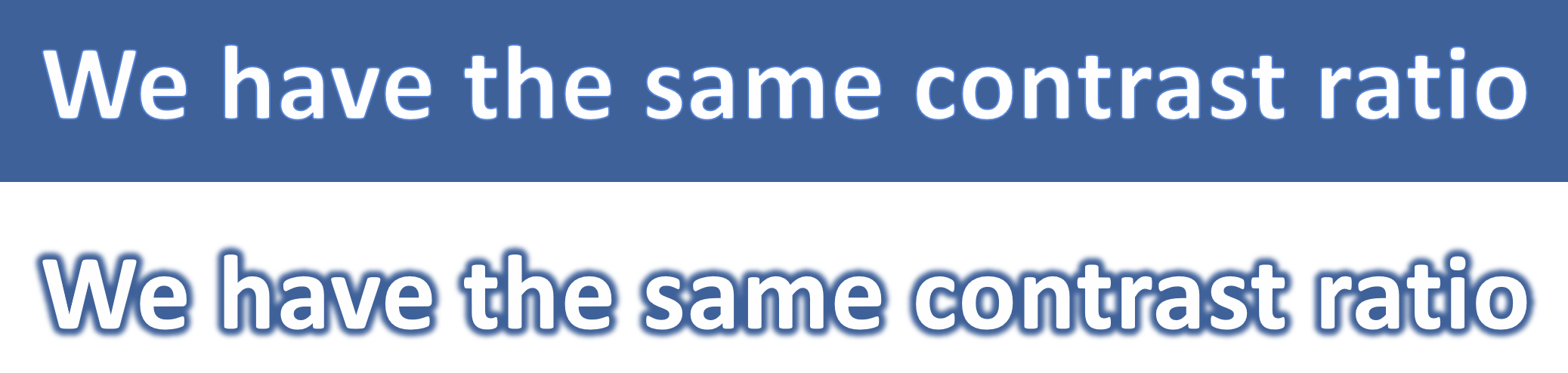
The white text in the image below has insufficient contrast.

Outline and halo
Text effects, like outlines, can impact perceived contrast. WCAG 2 states that the color of a text outline or border can be used as the text or foreground color when measuring contrast.
A text glow/halo around the letters can be used as the background color.
Exceptions
There are three exceptions to the 4.5:1 contrast requirement: large text, incidental text, and logotypes.
Large text
Large text is easier to read, so the contrast requirement is reduced to 3:1. WCAG defines large text as text that is 18pt and larger, or 14pt and larger if it is bold.
For example:
- Gray (#949494) 18 point text on white
- Purple (#C86ff1) 14 point + bold text on white
- In web pages, pixels are much more common for text size than points. 18 points maps to 24 pixels and 14 points to approximately 18.67 pixels.
- In CSS, bold text typically has
font-weight:bold, orfont-weight:700or greater.
Images of text have the same requirements, but it can be difficult or impossible to measure text size or font weight in an image.
Incidental
WCAG 2.0 defines four types of "incidental" text that are not required to meet the contrast requirements.
- Inactive: An inactive element, like a disabled Submit button ( ), is identified visually by its lower-contrast state.
- Pure decoration: Decorative text that is not meant to be read. An example of this might be a picture of a bookshelf on a library homepage. The titles of the books are not meant to be read by the user.
- Not visible to anyone: Text that is meant to be hidden, like an invisible skip link would not need to meet any contrast requirements until it becomes visible.
- Part of a picture that contains significant other visual content: Text that is not an important part of the information in the image, like a name tag on the shirt of a person in a photo of a party, does not need to meet any contrast requirements.
As a rule of thumb, text that would be part of the image's alternative text should probably meet contrast requirements while text that would not be added to alternative text can usually be considered incidental.
Logotypes
Text that is part of a logo or brand name has no contrast requirement. If we look back at the example of an image of text used earlier, the amazon music logo would be exempt.
Not mentioned
A couple important contrast considerations are not mentioned in 1.4.3.
Gradients, background images, and transparencies
Text over gradients, semi-transparent colors, and background images still need to meet contrast requirements, but WCAG does not provide any guidance on how to measure their contrast. We recommend usually testing the area where contrast is lowest.
Color changes on hover, focus, etc.
Text sometimes changes color while the user interacts with it using a mouse or keyboard. CSS can be used to define hover, focus, or active states for interactive elements. There is no mention of special consideration for these changes in text color, so text in all these states must meet the same contrast requirements (and must be evaluated independently).
1.4.6 Contrast (Enhanced)
The only difference between this Level AAA success criterion and Level AA 1.4.3 is that contrast requirements are more stringent. It requires 7:1 contrast for normal text and 4.5:1 for large text. Although higher contrast is often recommended, Level AA conformance is the requirement within common laws and standards, so we focus on 1.4.3 requirements throughout this article.
1.4.11 Non-text Contrast
WCAG 2.1, published in June 2018, moves contrast requirements beyond text. 1.4.11 Non-text Contrast (Level AA) reads:
The visual presentation of the following have a contrast ratio of at least 3:1 against adjacent color(s):
- User Interface Components: Visual information required to identify user interface components and states, except for inactive components or where the appearance of the component is determined by the user agent and not modified by the author;
- Graphical Objects: Parts of graphics required to understand the content, except when a particular presentation of graphics is essential to the information being conveyed.
There is one notable difference in how contrast requirements are applied. Contrast requirements in WCAG 2.0 are between text and background, but 1.4.11 requires contrast of at least 3:1 against adjacent color(s)" which means you may need to measure contrast in more than one place. A non-text element may have different contrast on one side than the other (like a wedge in a pie chart), or it may contain different-colored components that need 3:1 contrast with each other.
A triangle-shaped icon with an exclamation mark is used to alert the user to something important.

This graphic is composed of two important shapes—the exclamation mark and the triangle (usually reserved for alerts like these). That means there are 2 contrast ratios to consider:
- The contrast ratio between the white exclamation mark and the red triangle, which is over 3:1
- The contrast ratio between the red triangle and the gray background, which is less than 3:1.
This icon does not meet 1.4.11.
User Interface Components
There are two types of non-text elements that 1.4.11 says must have 3:1 contrast. The first are "User Interface Components," which are controls for distinct functions. For example, in a group of linked social media icons, each icon is a distinct user interface component.

States
Each state of the component must also have 3:1 contrast. States are temporary changes in a component, usually because of a user interaction, such as hovering with a mouse or tabbing with a keyboard.
When a user hovers over a custom checkbox, it turns bright blue (#00B0F0).
This checkbox has 2.5:1 contrast in the hover state, so it fails.
Except when "determined by user agent"
If you use the default styles provided by the browser, then these contrast requirements do not apply.
In Chrome, the default border for a text box has 2.4:1 contrast:
This outline is well below the 3:1 threshold, but since this color was "determined" by the browser and was not customized by the author, it is exempt. Because of the low default contrast, we recommend using CSS to increase the contrast for text boxes and other form inputs.
The most common example of a low contrast "state" is the an outline that appears when an element has keyboard focus. For example, a bright blue outline would be fairly distinctive on a white background but less visible against some colors, and can be almost invisible against a bright blue background.

This bright blue outline was a common for several years, especially in Chrome. Now, the keyboard outline in Chrome and Edge has both a dark and white line, giving it good contrast against any background. Firefox and IE use a dotted black line, which will have low contrast on a dark background. Instead of worrying about changing browser support, use the CSS :focus and outline properties to customize a focus indicator that always has at least 3:1 contrast while also matching your site design and aesthetics. While designing or testing these outlines, pay close attention to areas like headers and footers that often have different background colors.
If there is no visible indication of keyboard focus, this is a failure of 2.4.7 – Focus Visible (Level AA).
Graphical Objects
The second type of non-text element covered in this success criterion are "graphical objects". There are a couple key terms within this definition.
"Required to understand the content"
For something to be defined as a graphical object that needs 3:1 contrast, it must be "required to understand the content."
A Twitter icon that is a link would need 3:1 contrast. But if the link also includes the word "Twitter" (with at least a 4.5:1 contrast ratio), then the icon is no longer required to understand the content, so it does not have any contrast requirement.
"…except when a particular presentation is essential"
Certain types of images may need to be presented in lower contrast so they don't lose meaning or purpose. A heat map must use low-contrast colors so that underlying page is still visible.
Real-life imagery, like photos and screenshots, also fall into this category. So do logos.
1.4.1 Use of Color
WCAG 2 does not prohibit any specific color or color combination, such as red and green. The previous success criteria require that text and non-text elements have sufficient contrast. Success Criterion 1.4.1, a Level A requirement, prohibits using color alone to present meaningful content or instructions. It reads:
Color is not used as the only visual means of conveying information, indicating an action, prompting a response, or distinguishing a visual element.
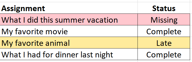
In this table of school assignments, the only indication that an assignment is missing or late is a background color. This is inaccessible to someone who is blind, and it may be confusing or inaccessible to someone who is colorblind or overrides page colors. This fails 1.4.3.
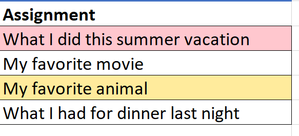
One way to address this is to add a second column for the status of the assignment (missing, complete, or late). You can still use color to reinforce information as long as color is not the only way this status is presented. In fact, it makes the information more accessible to users who can see the color difference.
Form instructions and errors
Color is often used in forms to identify required fields and form errors.
For example, a required field that is left empty may be given a red border.
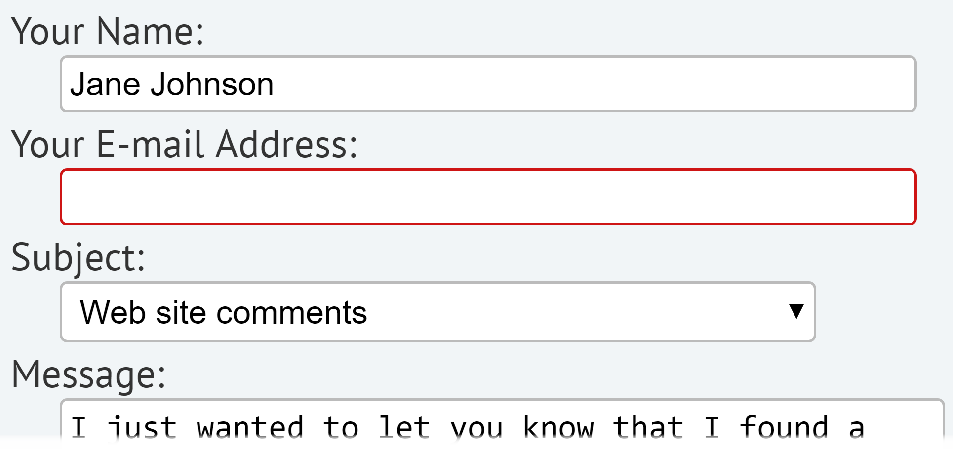
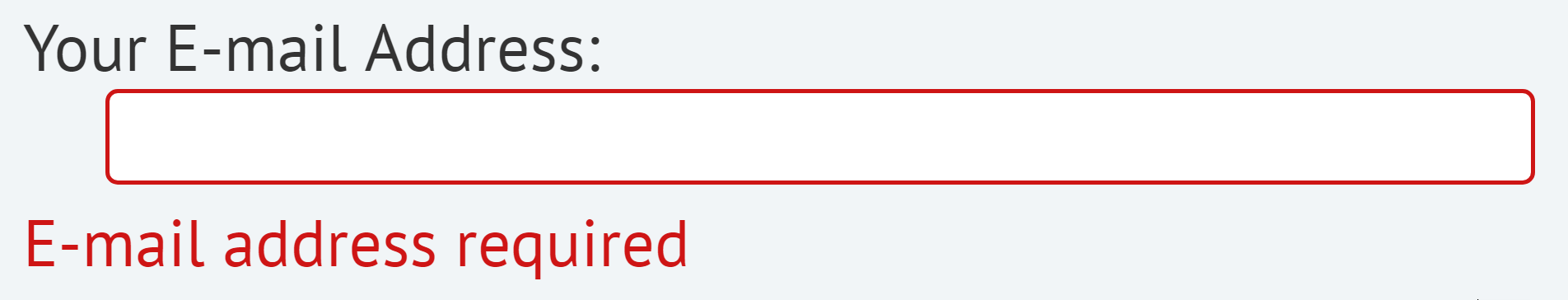
The red border is not enough on its own. The form field will also need an icon,
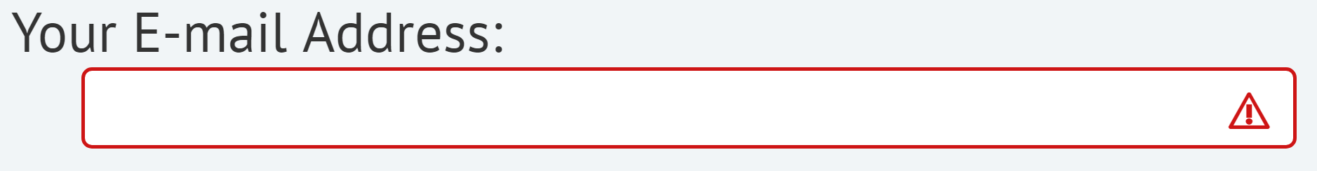
or an inline error message:
Color-only identification of links
WCAG 2 contrast and color rules overlap in one place: when color is used as the only way to identify a link. This does not apply to every link on a page. For example, links in the header of a webpage are understood to be links based on their position in the page, the use of whitespace, and often by a distinct font. This requirement refers to places where body text and link text appear together and where color alone is used to identify links (meaning the underline has been removed). For optimal accessibility and usability, maintain the underline on links. Otherwise two conditions must be met:
- 3:1 contrast between the body text and the link text.
- A "visual cue" (not just a color change) that appears on keyboard focus (we also recommend mouse hover). The most common way to meet this is to underline the link on hover and focus.
These requirements are in addition to the 1.4.3 text contrast requirement of 4.5:1. Meeting all three of these requirements simultaneously can be difficult.
A form ends with a line of text that reads: "By submitting this form, you agree to our Terms of Use." The dark gray (#2E2E2E) body text has 13.6:1 contrast on a white background. The blue (#0079AD) "Terms of Use" link has 4.8:1 contrast, so text meets the contrast requirements.
...but there is only 2.8:1 contrast between the body text and the link text. A slightly lighter shade of blue (#0081B8) would provide just over 3:1 contrast between the link and the body text:
... but now it has less than 4.5:1 contrast with the background! With these text and background colors, it is impossible to use non-underlined links and also meet the WCAG guidelines.
This becomes increasingly difficult if the links change color on hover or focus each of the colors in these states must also have at least a 4.5:1 contrast ratio difference with the background. WCAG 2.0 and Link Colors on the WebAIM blog explores the WCAG requirements for link colors in more depth.