Contrast and Color Accessibility
Evaluating Contrast and Color Use
Introduction
This article outlines tools and techniques that can be used to evaluate contrast and color use. Before beginning evaluation, make sure you are familiar with WCAG 2 contrast and color requirements.
There are several tools to help you evaluate contrast, each with its own strengths and weaknesses. This page will cover the following tools:
- WebAIM contrast checker
- WebAIM link contrast checker
- WAVE
- ColorZilla eyedropper
- Colour Contrast Analyser
- Accessibility Checker in Microsoft Office
The next page in this article will outline how to evaluate contrast using Chrome DevTools
WebAIM Contrast Checker
WebAIM offers an online contrast checker that will present the contrast difference between two colors, and will help you identify a color that meets the desired level of contrast. To use our contrast checker, enter Hex color values in the and fields. You can also click the color box next to each field to use a color picker or to enter a different color format (like RGB).
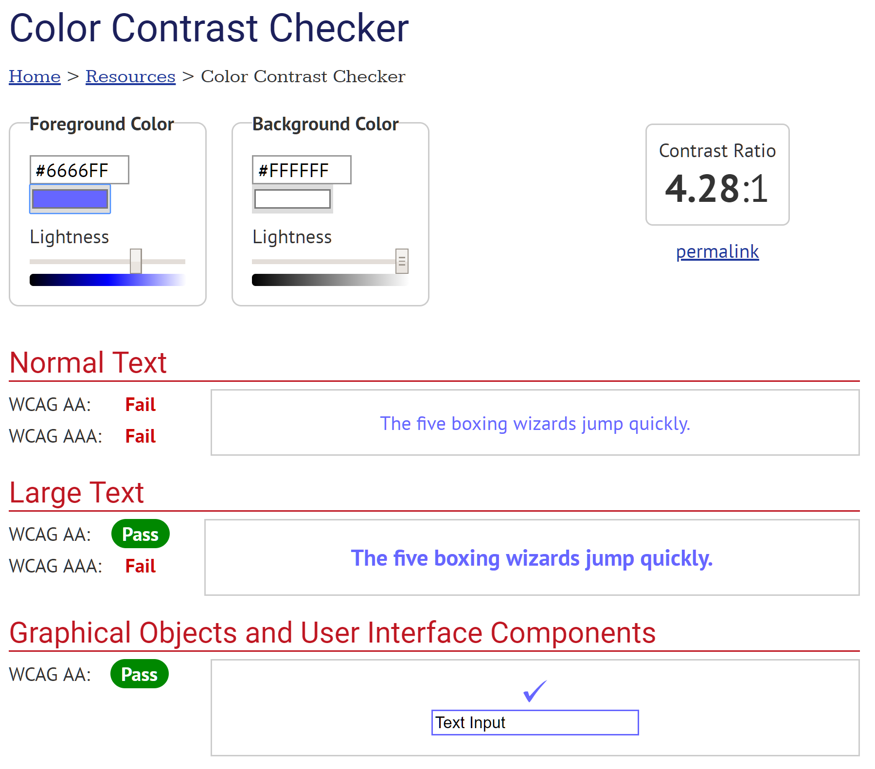
The tool will display the contrast ratio and state whether it passes or fails Level AA and AAA requirements for both normal text and large text, and also WCAG 2.1 Level AA non-text requirements—so there are five pass/fail possibilities.
If there is not enough contrast, use the sliders to change the foreground and/or background colors until you reach the desired contrast ratio.
WebAIM Link Contrast Checker
If a link is only identified by a color difference (typically meaning that it is not underlined), WCAG requires a 3:1 contrast ratio between the link text and surrounding body text. This is in addition to the 4.5:1 contrast of the link text to the background, and the body text to the background. The WebAIM Link Contrast Checker lets you test these three contrast requirements at once. It is very similar to the contrast checker, but there are three color fields instead of two: , , and . The tool will then show if these colors pass or fail each of these three contrast requirements.
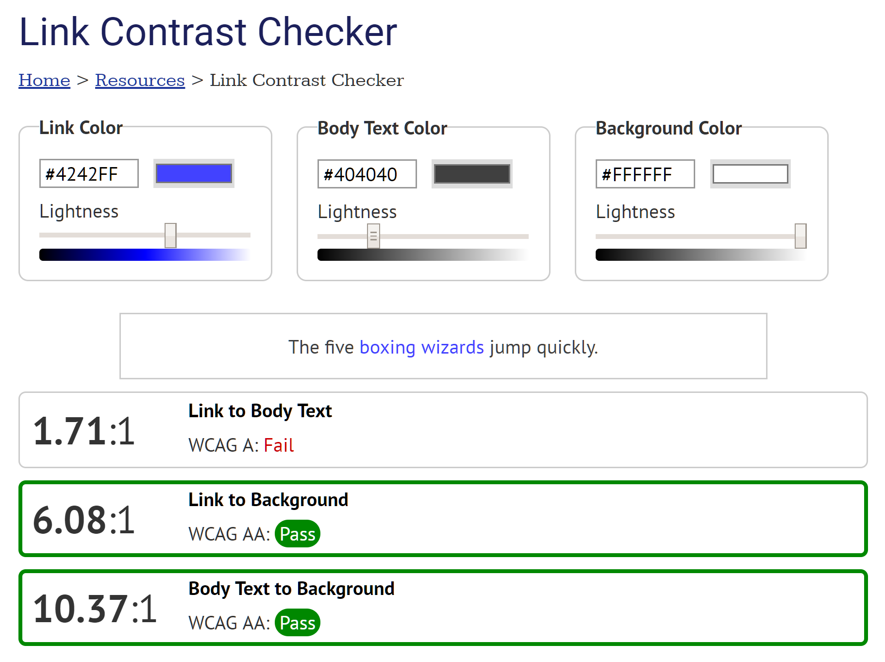
If one or more of these requirements fails, use the sliders to identify an acceptable color scheme. The best way to accomplish this is typically to darken the body text or lighten the background (assuming a dark on light color scheme).
To keep the interface as simple as possible, this tool does not show Level AAA contrast requirements or contrast requirements for large text.
WAVE
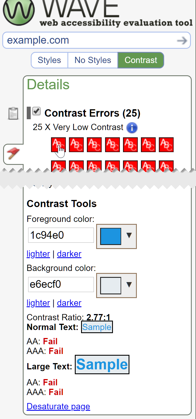
The WAVE accessibility evaluation tool scans text and text background styles and identifies most instances of text that do not meet the WCAG 2.0 AA 4.5:1 contrast ratio. WAVE also checks "Large Text" (as defined by WCAG) against the lower 3:1 contrast ratio requirement.
To use WAVE to find contrast issues:
- Go to wave.webaim.org, enter a webpage address, and run a WAVE scan, or use a WAVE browser extension to run WAVE directly in Chrome or Firefox.
- Select the button on the left-hand sidebar of the screen.
- An icon appears next to each instance of low-contrast text detected by WAVE.
- Click on an icon in the sidebar or within the page to see the contrast ratio for this text in the sidebar. The colors will appear in the and fields in the sidebar, followed by the contrast ratio.
- Use the and options below each field to find a color combination that meets WCAG requirements.
WAVE cannot detect all contrast issues. It does not account for background images, gradients, transparency, etc. It also cannot detect text that is part of an image. A manual scan for these types of contrast issues is still necessary.
ColorZilla Eyedropper
Text often appears within images, or over images, gradients, and other backgrounds that are not a solid color. Testing contrast in these instances requires the use of an "eyedropper" utility that allows you to select the color that appears in a specific place on the screen. ColorZilla is a popular eyedropper available for Chrome and Firefox.
After installing ColorZilla:
- Click the eyedropper icon that appears within the browser toolbar (
 ). A crosshairs icon will appear.
 - Center the crosshairs over the desired color.
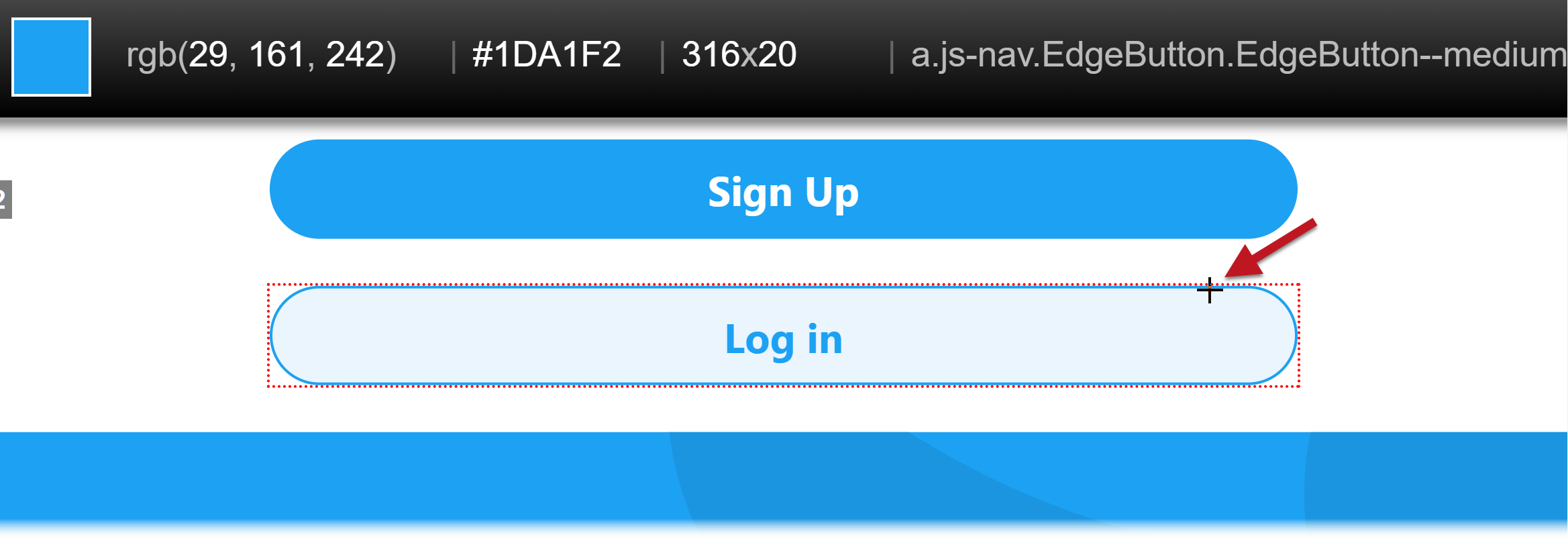
- Click and the color value will be copied to the clipboard.
- Paste this color into a contrast checker.
Enlarging the webpage sometimes makes it easier to select the desired color with an eyedropper. Use Ctrl (Windows) or command (Mac) and the + key to zoom in, the − key to zoom out, and 0 to reset the page size.
Colour Contrast Analyser
The Colour Contrast Analyser, or CCA, is a downloadable program for Windows and macOS that allows you to test contrast within any program. It accepts RGB, hex, and HSL formats, and it supports testing of colors with alpha (transparency, but the main feature that sets CCA apart is its ability to use the eyedropper tool to measure the contrast of anything on the screen.
To do this, select the eyedropper in the section and move the crosshairs to the text or foreground color using a mouse or the arrow keys. If the background is any color other than white, do the same with the eyedropper. CCA will notify you if the color combination meets AA and AAA requirements for text as well as WCAG 2.1 AA requirements for non-text content.
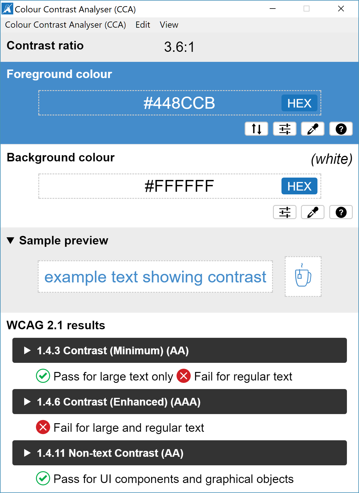
To change the lightness or darkness of a color with less change to the color itself, click the button (next to the eyedropper button) and check .
CCA's greatest strength may also be its greatest weakness—it works outside the web browser. If an evaluator is comfortable digging into the HTML and CSS of a webpage, it is usually more efficient to use WAVE and Chrome DevTools to check contrast. But CCA is an excellent tool evaluating text in images, and it really shines when evaluating electronic documents, such as Word and PDF files.
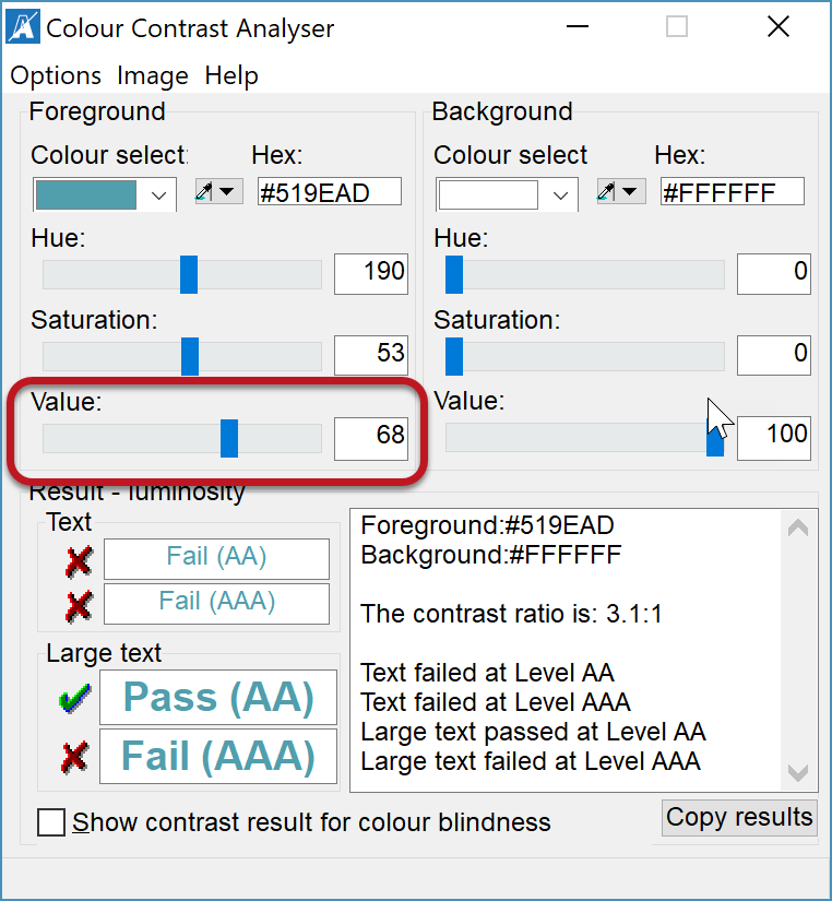
An earlier version, called "CCA Classic", is also available for download. The new version is more refined and useful overall, but the earlier version has a couple notable advantages:
- Better keyboard accessibility, including the ability to use the arrow keys with the color picker. This makes it much easier to select colors from small areas such as a text character.
- The ability to change just the lightness or luminance of a color. This is an important feature when trying to find a darker shade that meets WCAG contrast requirements with less change to the color itself. To enable this, select and check . Then use the slider toward the bottom of the window to lighten or darken the color.
Microsoft Office 365 Accessibility Checker
The Accessibility Checker in Microsoft Office 265 and 2019 can identify low-contrast text within its built-in accessibility checker. It evaluates both text and background color and automatically applies the lower 3:1 contrast ratio to large text. To check for low-contrast text in Word, PowerPoint, and Excel, select the tab > . Text with low contrast is identified as "".
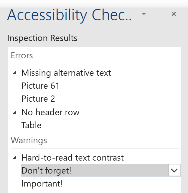
Click on a result to jump directly to that issue within the document.
As with other tools, a manual scan for text in images, or text over images/gradients/etc. is still necessary.
Finding Your Own Process
There is no one "best" tool for testing contrast. The tools you use will depend on the content being evaluated and on personal preferences. Likewise, there is no single testing process that is best for all content. But most contrast evaluations will include at least these three "steps" (although the order may vary):
- A preliminary scan for potential issues like:
- Color reliance (common in links and forms)
- Low contrast text
- Text in images
- Graphical objects or user interface components, as defined in WCAG 2.1
- Mouse hover and keyboard focus states
- When possible, an automated scan using WAVE or the accessibility checker in Microsoft Office 365 or 2019.
- A manual test of other potential issues using contrast checkers, ColorZilla, DevTools, Colour Contrast Analyser, or any combination of these.
Evaluating contrast and color use can take considerable time and effort, but this process will become more natural with time. Your preferred tools and methods will likely change with experience and may grow beyond what is outlined in this article, but applying the principles and steps in this article will provide a solid foundation of what is required in WCAG 2 and how to test for it.