Visual Disabilities
Low Vision
Types of Low Vision
"Low vision" is a broad label for a range of conditions that interfere with daily living and cannot be fully corrected by glasses. Although more common among the elderly, it can occur at any age because of conditions such as macular degeneration, glaucoma, diabetic retinopathy, or cataracts. Each of these conditions affects a person's vision in different ways. Content that is small, does not enlarge well, or has low contrast may be difficult to perceive.
Macular degeneration
The macula is near the center of the retina, which is the area in the back of the eye. "Dry" macular degeneration occurs as the tissues of the macula thin out over time, creating a gradual loss of vision. "Wet" macular degeneration, which is less common, occurs when blood vessels at the back of the eye begin to leak fluid or blood which blurs central vision and often creates rapid loss of vision. In either case, the person's central area of sight is affected the most. The images below help illustrate the effect of macular degeneration.

People who are sighted can simulate the impacts of macular degeneration by holding up their hand about 12 inches (30 cm) from their eyes, so that they can't see straight in front of them, but can see around the edge of their hand—and then trying to read something in their peripheral vision while remaining focused on their hand.
Glaucoma
Glaucoma is caused by increased pressure inside the eye that damages the optic nerve. The result is often the inverse of the effect of macular degeneration: loss of peripheral vision and blurry vision in the center. Text will be difficult to read. Some people have compared glaucoma to looking at everything through a straw.


Diabetic retinopathy
One potential effect of long-term diabetes is leaking retinal blood vessels, which can cause dark patches in the field of vision where the leaks occur, making it difficult to read text.

Cataracts
Individuals with cataracts have areas of opacity in the lens of their eyes, which creates a blurred or hazy effect, especially in bright light. Text may be difficult to distinguish from the background. High contrast is especially important for people with advanced cataracts.


Screen Magnifiers and Zoom
Screen magnification and zoom are the most common technologies that people with significant low vision use. Software or operating system settings can be used to magnify the entire screen or portions of the screen, allowing people with low vision to see it more clearly. Users can also adjust their browsers to zoom a web page or to increase their default text size.
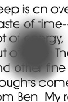
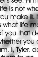
Some kinds of content do not well support being enlarged or zoomed. For example, low quality graphics that contain text may become blocky and pixilated when enlarged, making the text difficult to read. Consider the two images below. The one on the left is a screenshot of text that has been enlarged. The image on the right is a screenshot of text within a graphic that has been enlarged.

To make text more legible when enlarged, use true text as much as possible, rather than rasterized or graphical text.
Web pages should be designed so that there is no loss of content or functionality when they are enlarged/zoomed or when the text size is increased. With few exceptions, horizontal scrolling should be avoided—it is especially difficult to read page content when the user must scroll or pan to read lines of text that extend off the screen. Implementing responsive/adaptive design to support small screen and mobile devices will also better ensure that content adapts to a screen when it is zoomed or enlarged.
High Contrast and Customized Colors
Web content with low contrast, meaning the brightness difference between text or a graphic and its background, can be difficult to read, especially for people with low vision. Some color combinations are not easy on the eyes for anyone, especially for people with low vision. Color contrast can be checked using WebAIM's Contrast Checker to ensure it meets the WCAG 2 guidelines.
While authors should ensure their content has sufficient contrast, some users with low vision may need even more contrast. Some may benefit from specific color combinations, such as blue text on a yellow background. Users with low vision may enable high contrast modes or may override default colors via settings in their operating system or web browsers. When these are enabled, users may not see the author-defined web page colors.
Pure black-on-white content can sometimes feel too contrasty and may be difficult to read. Designers should try to create a visual presentation that is both pleasant and conformant. Ensure that color is not used as the only means of indicating or differentiating meaning or content.