Screen Sharing Has Become Much More Common
For many of us, phone calls have largely been replaced with meetings over video conferencing platforms like Zoom. One advantage to these platforms is the ability to share computer screens. We have all likely been in virtual meetings where someone says, “it’s easier if I just share my screen,” and it’s true that screen sharing is often an effective way to demonstrate tasks or share information. However, screen sharing comes with some accessibility dangers.
Everyone benefits from clear verbal descriptions of onscreen actions. We have all been in situations where it is difficult to follow information presented during a screenshare. A shared screen is often presented much smaller on the participant’s end because screen space is shared with the meeting chat, a gallery of participant videos, and other meeting controls. Participants joining over the phone have an even smaller screen or may rely solely on audio. A poor connection can add to the difficulty of seeing the shared screen clearly. Even attentive participants will be distracted away from the shared screen, or they may need to look at another screen or program to follow along with a demonstration.
Even if you have experience providing accessible presentations, it can be difficult to make a screen share widely accessible. Presentations are usually slide-based and information-centered, and are often rehearsed. Screen sharing, on the other hand, is often an impromptu demonstration. No matter how you share, you may benefit from a few tips to help you share your screen in ways that will improve access for all.
Avoid Accessibility “Four-Letter Words”
When it comes to presenting content from screen sharing, think of the word “here” as a four-letter word. Like many four-letter words, it doesn’t need to be completely avoided. It can add flavor to a meaningful sentence. But if you find yourself saying “here” repeatedly withing a sentence or two, or with no other context (e.g., “I’m going to click here, then here…”), this should be a red flag that you need to broaden your vocabulary so that participants who cannot adequately see the screen share are getting the information they need to understand what is being demonstrated. Other ‘four-letter words’ to avoid include “this”, “that”, “there”, and “see”. When you use these words heavily, it is likely that you are relying on the participants ability to see what you see at the time you are seeing it.
Action + Name + Location + Description
To combat dependence on words like “here”, try using this formula to convey the important information in your screenshare:
Action + Name + Location + Description
1. Action
A clear description of your on-screen actions helps the user understand the action, what makes it unique, and often what will follow. Descriptive action words include:
- Click to activate buttons and links
- Select, choose, or pick from a group of options in a <select> menu, radio buttons, tabs, etc.
- Expand or collapse an accordion, menu, or tree.
- Move or drag a slider
- Play a video
- Check a checkbox
- Press a key on the keyboard
- Turn on/off a switch
Saying “Click” is Fine
Some people avoid using the word “click” because they consider it a description of a mouse-only interaction. It’s important to strive for inclusion in our language, and it is true that “click” has its roots in the sound made when using a mouse, however, “click” has evolved into a word that describes an action that can also be accomplished with a touchscreen or keyboard. In fact, click is probably the best word to describe the universal action of activating an element. The words that people typically use in its place are often awkward (e.g., “activate” a button or “follow” a link) or more accurately describe other actions (e.g., “select” suggests picking from a list of options and “press” is associated with keys on a keyboard).
If an action only works with a mouse, it is important to acknowledge this issue, but poor accessibility is not a good reason to abandon a very useful word. If there is keyboard functionality that can be used in place of a mouse-only action, be sure to share this (e.g., “click-and-drag with a mouse to reorder items” or “use up/down buttons with a keyboard”).
Right-click is also possible with a keyboard. If an element can be accessed with a keyboard, and if the easiest way to interact with this element is using the right-click menu, don’t be afraid to use this interaction.
2. Name
Next, give the relevant element or control an accurate and consistent name. For elements that contain text, use the text as you describe an action.
For example, an application has a button labeled “Quit”.

- Needs improvement
- “I’m going to click this button to close the application.” Someone listening to these instructions would probably assume the button is labeled with “Close.”
- Better
- “I’m going to click this button to quit the application.” The button text matches the description of the action.
- Best
- “I’m going to click the button to close this application.” It is clear that the button is labeled with the word “Quit.”
If a control is a graphic or icon, the name should ideally match the way this element is described by a screen reader. In many applications (Slack, Zoom, Acrobat, Word, PowerPoint, etc.) a tooltip appears when hovering over graphical controls or when navigating to them with a keyboard. This is usually the name that will also be read by a screen reader and will also be used in help or search options within the program.
For example, if I am demonstrating how to clear font and paragraph styles on a block of text in Word:
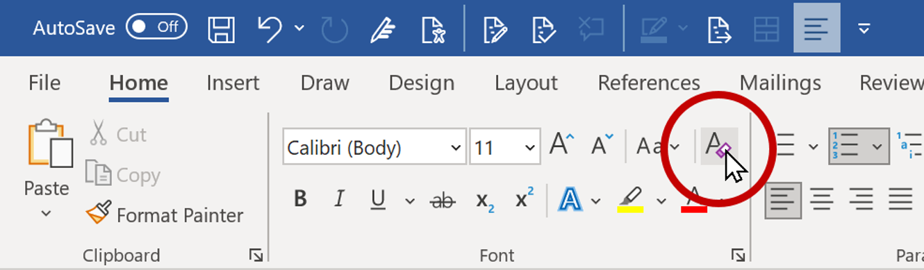
- Needs improvement
- “Click the eraser button” is a description of what the button looks like, not what it is called. This doesn’t give a blind participant much to go on.
- Better
- “Click the Clear Formatting button” is close to the correct name.
- Best
- “Click the button” presents the name that appears in the tooltip. There will be no confusion when a screen reader user navigates to, or searches for, this control.
In web pages and applications, finding the name that will be read by a screen reader sometimes take a bit of extra work, and there can even be a mismatch between what is presented visually (usually called the “label”) and the name that will be read by the screen reader. Our article on decoding label and name for accessibility gives some guidance on understanding and addressing this issue, but you may have to take your best guess, especially if you didn’t have time to research a task ahead of time.
3. Location
As you describe an onscreen action, describing the location of your actions on the screen can help participants keep track of where you’re at on the screen. It may also remind them to stay engaged or re-engage if they have looked away, or help them visualize your actions if they are not looking at or can’t see the screen.
Describing the location of your action may seem like an entirely visual exercise, but it often provides useful information to screen reader users as well, especially if a webpage or application has good structure and semantics under the hood. For example, top and bottom of the page almost always translate to start and end of the content. A left-hand sidebar typically precedes the main content. The footer in a webpage, the second tab in a tab group, the last step in a list, and a dialog on top of the main window–these are all descriptions that are meaningful to screen reader users.
It is often a good idea to repeat your demonstration, especially if you expect someone to follow along. This gives participants a chance to pay attention to your action the first time you perform it and then gives them the time and support as they duplicate the action on their end.
4. Description
Finally, describe important or unique characteristics of an element that will make it easier to find it on the screen. This may include the type of element or interaction–a button, link, tab, slider, checkbox, group of radio buttons, etc.–but this may not always be necessary. If you say, “I’m going to click “, it probably doesn’t matter that “Continue” is a link or a button (or a link that looks like a button, or a button that looks like a link).
Descriptions are especially important for icons. Building on the example for clearing formatting in Word, the name of this control will only appear when participants hover over the icon with a mouse or navigate to it with a keyboard, meaning they may need to navigate dozens of other controls to find it. Participants may also need to look away from your shared screen so they can follow your instructions on their screen. You could describe this icon as “A letter ‘A’ being erased” or “the icon with an eraser”.
Some icons have become a standard part of many interfaces. For example, a button with 3 horizontal lines almost always indicates a menu; clicking a gear icon will open settings; 3 dots means more options. Video players use a standard set of icons for play controls, volume, and captions. In many of these cases, adding a description of the image is overkill, but adding the word “icon” helps people know that they are looking for an image instead of text.
If difference in color is used to emphasize something, this may be worth sharing, but make sure your description includes more than just color. Some users may not be able to distinguish certain colors or may have software in place that changes the colors on their screen. So instead of saying “Click the green button”, say “Click the green button.”
Adapt to Fit Your Needs
Changing the size of your screen, text, or mouse pointer can make it easier for participants to follow along as you share your screen.
These recommendations will need to be adapted to the your actions and audience. You don’t want to bore the audience by being too descriptive. When a standard dialog opens, saying “I am going to close this window by clicking the gray x in the upper-right corner of the dialog” is overkill. “I am going to close this dialog” is probably better. The expertise of the participants in your meeting should also be considered. There is probably no need to describe the appearance of a widget when going through a mockup with the designers that built it.
When repeating an action, it is usually best to reduce the level of detail over time. Returning to the example in Word:
- The first time you demonstrate the task, including the action, name, description, and location is probably best: “I am going to highlight the text and click the option in the tab. It’s in the group and it looks like a letter ‘A’ that is being erased”. This helps the user know what the option looks like and gives them time to find it on their end.
- Action, name, and a shorter description of the location is sufficient the second time: “With the text selected, I’ll Click in the tab.”
- Name is probably enough the third time: “Highlight the text…Clear all formatting”
- By the fourth/fifth/tenth time, a general description of the action, like “clear formatting for this text”, is probably enough.
Feel free to add, remove, or reorder the parts of your description. For example, it is often a good idea to start by describing the location of an element so that the user knows where to focus their attention on the screen (“Up in the tab, I am going to find the icon that looks like a letter A…”). Changing the order will also keep your speech more natural and engaging.
There will always be opportunities to improve how you describe your onscreen actions. During one meeting, you might hear yourself using too many accessibility ‘four-letter words’ like “here.” On another occasion, you may realize that your use of action + name + location + description has become too detailed or repetitive. With practice, you will find this process becomes more natural, and it will be easier to make immediate adjustments. Whenever you share your screen, it will be more useful and accessible for everyone!
As a screen reader user, accessing information via a screen share on Zoom, Teams etc is problematical. The only option I am aware of is to use the screen reader’s OCR capability. Depending on various factors, this may range from being very successful to yielding nothing useful.
Andrew
This is really useful, thanks so much for sharing it. I’m always trying to improve my audio descriptions so having a recipe or formula to follow makes it easier for me to remember what’s needed.
It is possible to share a PowerPoint via Teams in such a way that any delegate can navigate through the slides at their own pace, and a screen reader user can access the information on the slides (assuming them to be accessible).
To do this, when you select the screen share option, towards the bottom of the screen is a “PowerPoint live” heading followed by a list of recently used PowerPoint presentations; select one of these or use the browse option to find the presentation to share.
Thanks for this tip, Steve. We mainly use Zoom, so I just looked up Microsoft’s guideance on participant view in Teams. I can see how it could be helpful to navigate a PowerPoint presentation within Teams instead of having to open another program, and how “Sync to Presenter” could help screen reader users align the slide that they are reviewing with this slide that is being shown onscreen.