As WebAIM has developed the WAVE accessibility evaluation tool over the years, many of our improvements have been driven by our own evaluation work. Here are some “power user” tips I use to get the most out of WAVE.
This article is for those who are already familiar with WAVE. If you are somewhat new to WAVE, we recommend reviewing the video introduction on the WAVE homepage. We also recommend reviewing our web accessibility evaluation guide for details on how to use WAVE as part of a thorough web accessibility evaluation.
Use WAVE Browser Extensions
Using the WAVE website is a good way to become familiar with WAVE or to introduce it to others, but to really unlock the power of WAVE, you need to use a browser extension for Chrome, Firefox, or Edge. The extensions are completely local, meaning you can test any webpage open in your browser at any point in time. Many of the tips addressed in this article require use of the WAVE browser extension.
Tools and techniques in WAVE
Every option and panel in WAVE is designed to make testing more efficient and powerful. Take time to explore and apply them all.
Disable styles
Complex pages can sometimes become cluttered when WAVE is activated, and sometimes WAVE might identify errors in content that is hidden with CSS. Turn off in the WAVE sidebar to streamline and linearize the page content, making it easier to evaluate for accessibility. This also allows you to evaluate the reading and navigation order of the page content (which may be different from the visual order when styles are enabled). Personally, I spend most of the time using WAVE with styles disabled.
Show and hide icons in the Details panel
I think the most under-utilized feature in WAVE is the ability to show and hide icons in the details panel. I use this constantly to dial in the level of information displayed by WAVE. To adjust this, open the tab in the sidebar and uncheck the checkboxes to hide a group of icons (e.g., every icon related to ARIA) or to hide every instance of a specific icon.
I like to look at the whole page when I first run WAVE to get a feel for the types of issues that are present, but sometimes WAVE displays too many icons at the start. The most common culprit is ARIA–I have evaluated many pages with over 1,000 ARIA icons.
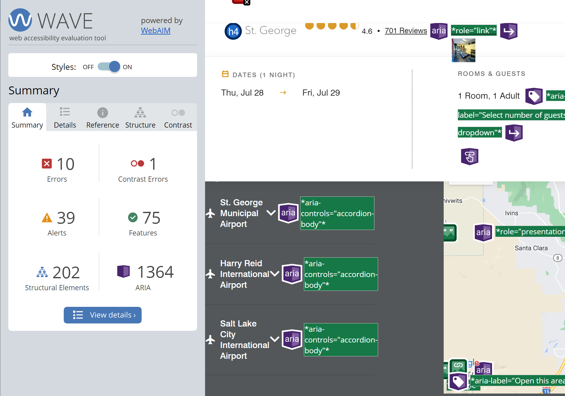
ARIA icons on this page outnumber all other icons by over 1000.
After getting a big picture view of a page, it can be effective to focus on a type of content, like images or forms. Our evaluation guide is organized this way. For example
- Show only icons related to regions and headings and then use the panel.
- Hide all icons except for those with very low contrast, and then open the panel.
- To focus on ARIA use, hide the other icon groups–errors, contrast errors, alerts, features, and structural elements.
Relevant icons may sometimes be hiding in other groups. Headings are in the Structural Elements category, but there may also be errors and alerts for empty headings, skipped heading levels, etc. Most ARIA icons are in the purple ARIA category, but error icons exist for elements with aria-labelledby and aria-describedby that lack corresponding ids, and also for ARIA menus that lack menu items.
Review the Reference Panel
The Panel in WAVE provides concise details for each WAVE icon. You can learn more about any WAVE item, including how it might impact users and what you may need to do to improve accessibility. Plus, there are links to relevant resources and WCAG 2 success criteria.
Use the color picker in the Contrast Tab
WAVE will identify low-contrast text automatically, but only when it can determine the text and background colors. Contrast is not tested on text with background images, gradients, etc. You can use the contrast checker built into the panel to test foreground and background colors of text not identified by WAVE and to evaluate non-text content.
To do this, click on the color block below or . A dialog will appear that includes an eyedropper icon.
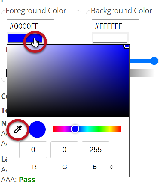
Click on the eyedropper and then use the mouse (it is mouse-only) to click on the desired element in the page to pull its color value into the contrast WAVE contrast panel. You can use the eyedropper to extract foreground and background color values from images, text with gradients, or other page content.
The color picker dialog will differ slightly based on your browser and operating system, and there is no eyedropper option in Firefox for Windows.
Check for color reliance
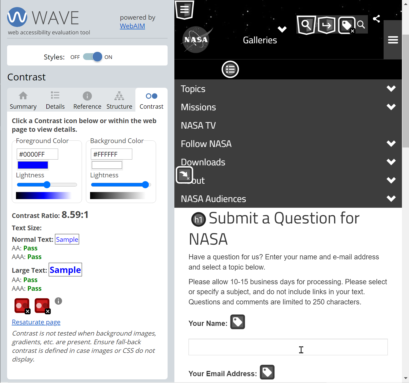
Within the Contrast panel in WAVE is a “Desaturate page” link. This will remove colors from the page–making this content greyscale. This allows testing of any instances where color alone might be used to convey information or functionality–and it also better demonstrates the impacts of low contrast content.
Dig deeper with the Code panel
Opening the Code panel at the bottom of the page in WAVE will show the underlying DOM of the page. You can also get to this by clicking a WAVE icon in the page and selecting “Code” from the tooltip. Clicking any icon in the page or in the sidebar will bring the relevant code into view. This can be especially helpful for analyzing code relationships, such as with the <label> element or aria-labelledby.
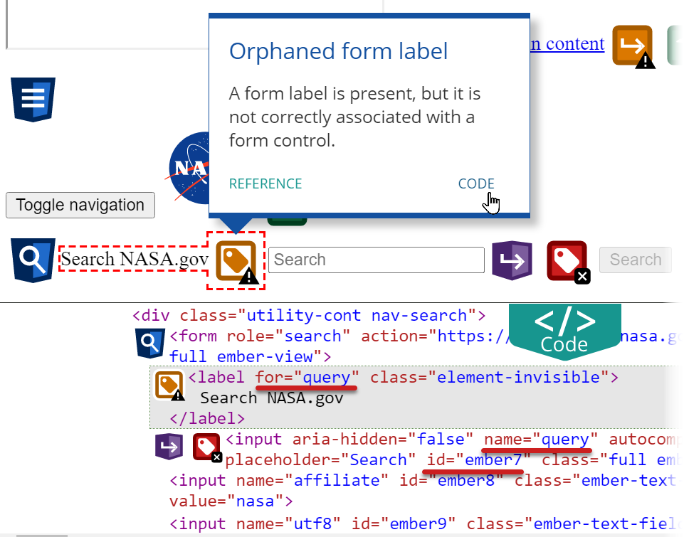
WAVE icons show that there is an orphaned form label. The code panel shows where the problem occurs–a mismatch between <label for…> and <input id…>.
Use WAVE With Other Tools
WAVE is very useful on its own, but its power can be multiplied by using it in conjunction with other tools.
Some of the following examples have screenshots and instructions for Chrome DevTools, but these tips can all be accomplished with other browser developer tools as well.
Open the same page in two windows
When I am evaluating a page, I will often open the same page in two browser windows or tabs. One window is for WAVE, and the other I use for different tasks including:
- Keeping track of what the original page “looks” like without all the WAVE icons. This is especially useful when Styles are disabled in WAVE.
- Interacting with the page with a mouse and a keyboard to identify areas that require additional evaluation (rollover menus, dialogs, error messages, responsive designs that trigger mobile view, etc.).
- Testing with a screen reader and then using WAVE to evaluate problem areas.
- Using DevTools to dig deeper into ARIA use, analyzing an element’s accessible name, reviewing different element states, etc.
Lock in element states
There may be content on the page–like a rollover menu or tooltip–that only appears on mouse hover or keyboard focus. With DevTools open, go to the tab and use the button to toggle element states like :hover and :focus. Then run WAVE to evaluate the content in this state. Enabling the hover or focus styles for links before activating WAVE will allow the text contrast of these link states to be tested
Not seeing the keyboard focus styles that you expect after selecting :focus? Try :focus-visible or :focus-within.
Remove unnecessary regions
On most websites, the header and footer–and sometimes other areas–are identical on almost every page. If you have already evaluated these areas, use DevTools to remove them from the page before running WAVE. I find the easiest way to do this is to navigate the DOM with the arrow keys and remove elements with Delete. This can simplify a page (and WAVE’s results).
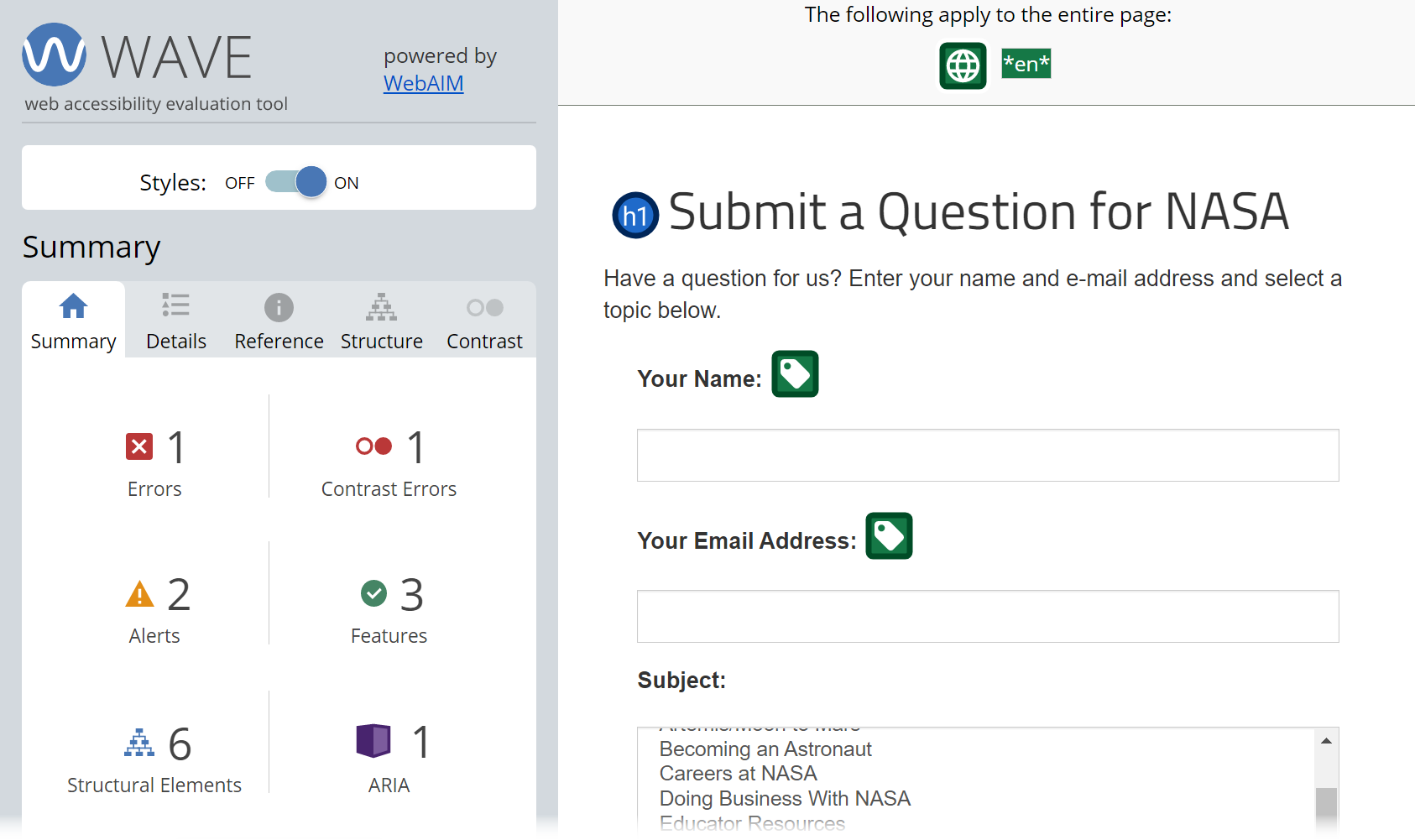
This page is much easier to evaluate after removing the header and footer
Test mobile views
DevTools allows you to emulate mobile devices within a desktop browser. After you have a web page presented in a desired mobile view, you can then activate WAVE to test the page in that state. Keep in mind that the WAVE interface may not display correctly in very small viewports, but you can easily turn off the mobile emulation to maintain and better view the WAVE testing feedback.
Another way to trigger a mobile view is to reduce the width of the browser window. Once you have reached the desired view, run WAVE. Then increase the width of the page to accommodate the sidebar, but do not make the page too wide or you will lose the mobile view.
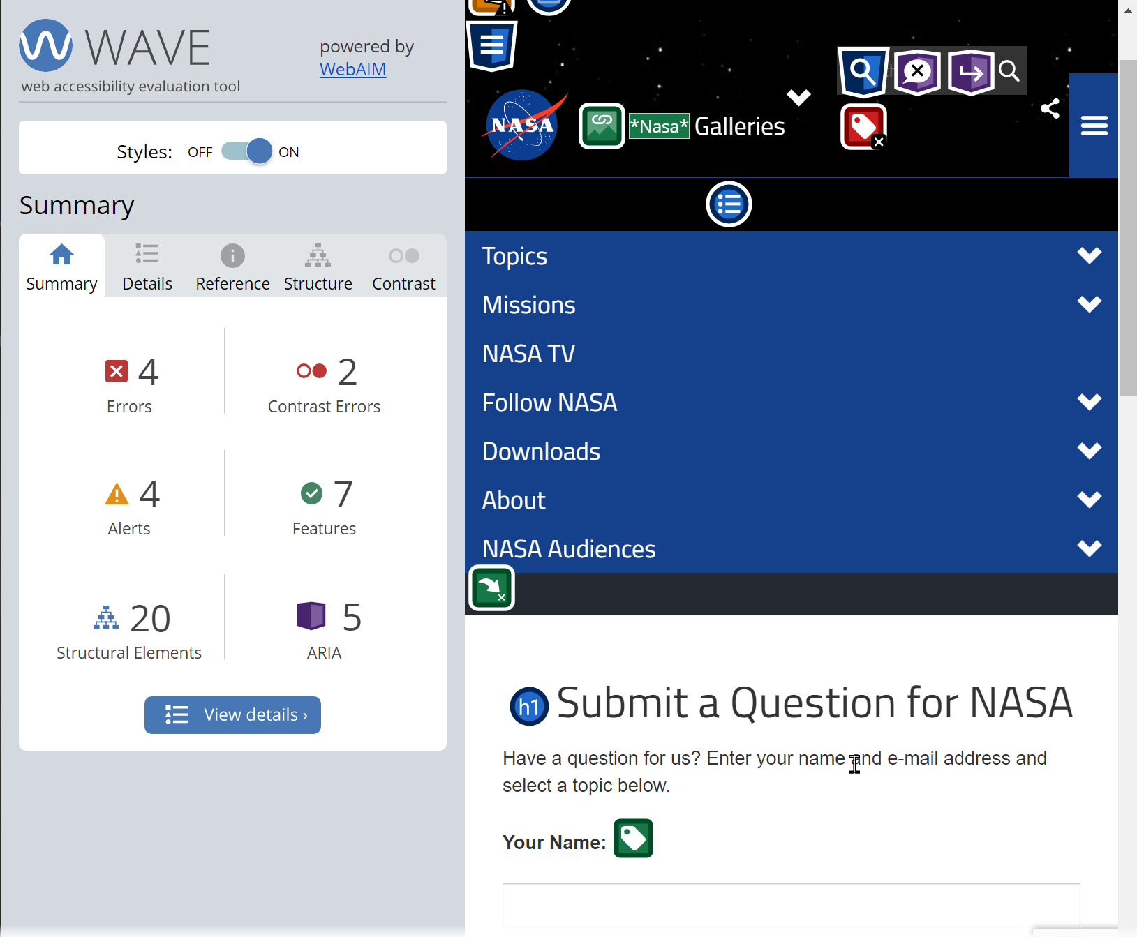
Zoom out to see more
If you are having trouble viewing all the icons in the page, try making the page smaller by pressing Ctrl on Windows/command on Mac and -. Ctrl/command and + (technically =) will make content larger and Ctrl/command and 0 will reset browser zoom.
Share Your Tips
Do you have any WAVE tips or tricks? Please share them in the Comments.

I miss the old WAVE toolbar from Firefox pre-v57 when there was the “Reset ” button that erased all the WAVE artifacts from the page.
Would it be possible to add that functionality back into WAVE?
In the meantime, there’s a bookmarklet to erase the WAVE artifacts called Low Tide:
https://andrewnordlund.github.io/low-tide/
Andrew –
That’s a very nifty bookmarklet! We’re planning to build this functionality into a near-future update so that the extension can be reset without refreshing the page.
It may seem minor but the desaturate button is extremely helpful. Thankfully there is a resaturate button for this function.