A working draft of version 2.2 of the Web Content Accessibility Guidelines (WCAG) has been published for feedback. WebAIM is thrilled to see the work on these formative guidelines continuing and we appreciate the efforts of the W3C’s Accessibility Guidelines working group. Below are WebAIM’s plain language summaries of each of the new proposed success criteria, as well as discussion and our recommendations.
WebAIM currently supports adoption of 1 success criterion as currently drafted. The remaining 8 proposed success criteria would benefit from greater clarity and specificity before they are considered for inclusion in WCAG. In some instances, we have provided recommendations and justifications for shifting proposed success criteria to a different WCAG Level.
WebAIM’s lack of support of a success criterion does not mean that we are opposed to the principles or recommendations provided. It instead simply indicates that we believe it is not currently viable for inclusion in WCAG as drafted.
Focus Visible to Level A
We fully support the transition of Focus Visible from Level AA to Level A. While this is the first time that a sub-version of WCAG 2 would modify the level of an existing success criterion, this is a much-needed and welcome change that WebAIM has promoted since the release of 2.0 in 2008. While this success criterion still lacks a clear definition of what constitutes a “visible” focus indicator (this is now defined in additional proposed success criteria below), this elevates the critical need for keyboard focus indicators.
Focus Appearance
Summary
Focus Appearance (Minimum – Level AA) requires that focus indicators have a minimum number of pixels that change color with at least a 3:1 contrast ratio. The focus indicator must also contrast with surrounding colors. The element must not be entirely hidden when it receives focus.
Focus Appearance (Enhanced – Level AAA) additionally requires more pixels that change with at least 4.5:1 contrast and that the element be entirely visible when it receives focus.
Discussion & Recommendations
Minimum area
The focus indication area is greater than or equal to a 1 CSS pixel border of the focused control, or has a thickness of at least 8 CSS pixels along the shortest side of the element.
This definition introduces confusion because it equates a surface area to a perimeter (which is inherently without area). We recommend the addition of clarifying language, such as “The focus indication area is at least as large as the area covered by a 1 CSS pixel wide border of the focused control, or has a width of at least 8 CSS pixels along the shortest side of the element.”Â
Change of contrast
The color change for the focus indication area has a contrast ratio of at least 3:1 with the colors of the unfocused state.
It is not clear what “the unfocused state” refers to. Is it the unfocused state of the interactive element? Or of the focus indication area (which cannot be focused)? Our recommendation for much clearer language: “The focus indication area has a contrast ratio of at least 3:1 against the same pixels when the control is not focused. This contrasting area must be at least as large as the Minimum Area.” This would clarify that the focus indicator does not necessarily have to contrast with the element, but only with a minimum area that the focus indicator covers.
Adjacent contrast
The focus indication area has a contrast ratio of at least 3:1 against all adjacent colors for the minimum area or greater, or has a thickness of at least 2 CSS pixels.
This ensures that the focus indicator has sufficient contrast with its adjacent colors or is sufficiently large. We recommend only changing “for the minimum area or greater” to “for at least the minimum area” for clarity and harmony.
Unobscured
The item with focus is not entirely hidden by author-created content.
We understand the intent to be that the focused item is not obscured by page elements, such as sticky headers/footers or expanded menus or dialogs. However, “not entirely hidden” would allow all but one pixel of the focused element to be hidden. We recommend changes to ensure focused elements are fully or substantially visible at the time they receive focus (as is required under the “Enhanced” requirement at AAA).
Adoption
We do not support adoption of this success criterion as drafted. Adoption would be supported if clarifications and changes are provided to scope and language of the normative text.
Fixed Reference Points
Summary
Fixed Reference Points (Level A) requires that when page numbering is provided in “electronic publications” that users can navigate to each page and that the page numbering remains consistent when the content is modified.
Discussion & Recommendations
This success criterion is problematic. This is not an issue that WebAIM has encountered in HTML content. While the criterion applies when “a web page or set of web pages is an electronic publication“, it does not provide a clear distinction as to when a web page is considered an “electronic publication”.
This criterion would to be most applicable to file formats such as PDF or EPUB, where page numbering is most relevant. It would be optimal for page numbering issues be addressed in the user agents that present these documents, rather than by placing the burden on content authors.
The only published technique currently provided by the W3C is to provide a list of links to every page within the document. This is obtrusive to design and would itself introduce significant overhead and potential confusion for many users with disabilities. For example, imagine having to navigate through numerous links, one for each page, at the beginning of an online journal article.
Adoption
We oppose the adoption of this success criterion as drafted. We would, however, support its adoption at Level AAA.
Dragging
Summary
Dragging (Level AA) requires that dragging functionality that is not essential to the activity has an alternative operation that works via single click/touch inputs.
Discussion & Recommendations
While dragging functionality would seemingly be covered by SC 2.5.1 Pointer Gestures at Level A , the non-normative W3C documentation clarifies that it is not, despite common sense suggesting that dragging is a “path-based gesture”. This new criterion, therefore, is a welcome addition to better ensure that users with motor disabilities, particularly those lacking fine motor control, have an alternative method for performing dragging functionality that does not require use of a keyboard.
Adoption
We support the adoption of this success criterion as drafted.
Pointer Target Spacing
Summary
The Pointer Target Spacing success criterion (Level AA) requires that touch targets be contained within a 44×44 pixel area that does not contain a portion of any other touch target.
The intent is to limit errant activation of controls that are too close together. Exceptions are in place for inline links and default controls, such as default select menu options.
Discussion & Recommendations
The normative text makes understanding this success criterion rather difficult. The “Summary” wording above would provide a much more understandable alternative.
While the success criterion states, “This criterion has been formulated to increase the hit-area of small targets”, this is not at all what it actually does. It instead requires that targets not be too close together.
Like “Target Size” at Level AAA in WCAG 2.1, this success criterion would certainly address accessibility issues for users with motor disabilities, and it aligns with mobile design best practices, but there are many edge cases and unintended consequences. In some cases, the easiest way to meet this success criterion is to simply make the touch targets smaller.
Consider several adjacent clickable icons that are 36X36 pixels each, with 3 pixels of space between each icon. For the middle icon it is impossible to have a 44X44 pixel area that doesn’t include part of an adjacent icon, so this would fail the Pointer Target Spacing requirements.
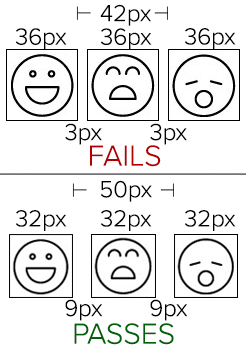
If, however, the icons were made smaller at 32 pixels in size with 9 pixels of space between each, they would take the same amount of horizontal space and each target would fit exclusively in a 44X44 pixel area (thus passing this success criterion), but the icons would be now much smaller and thus more difficult for users with low vision and certain types of motor disabilities to see and activate. One accessibility issue has been improved while potentially making another one worse. This introduces a conflict between disability types, with users with motor disabilities prioritized over users with visual disabilities.
Adoption
Because of these potential conflicts and the impact this can have on design and functionality, we do not support the adoption of this success criterion as drafted, but strongly encourage its adoption at Level AAA.
Findable Help
Summary
The Findable Help success criterion (Level A) requires that at least one form of self-help or human contact functionality or information, if present on single page web applications or sets of web pages, be presented in the same relative order each time it is presented.
Discussion & Recommendations
While Consistent Navigation (Level AA) generally covers these requirements, the added impact of inconsistency in navigation order for important site functionality, such as help or contact details, supports adoption of this new success criterion.
However, the title of this success criterion “Findable Help” does not really align with its purpose and intent, and thus introduces potential confusion. This success criterion does not actually require that help be “findable”, only that it be consistently navigable.
The Understanding document for 3.2.6 significantly overstates the normative requirements and goes well beyond its scope, even so far as indicating the type of help that a site should provide and who within an organization should be contactable. While wonderful recommendations, these are not directly relevant to the success criterion at hand.
It seems an oversight that this success criterion does not also include the requirements found under Consistent Identification (Level AA). In other words, a contact link could be called “Feedback” on one page and “Contact Us” on another, but could still pass “Findable Help”.
Adoption
We oppose the adoption of this success criterion as drafted, but we would support adoption if it is improved by being given a more accurate title (e.g., “Consistent Navigation to Help”). It could further be greatly improved by adding requirements for consistent identification.
Hidden Controls
Summary
A clear summary for the Hidden Controls (Level AA) proposed success criterion is not really feasible. The current success criterion language is “Controls needed to progress or complete a process are visible at the time they are needed without requiring pointer hover or keyboard focus, or a mechanism is available to make them persistently visible.”
Discussion & Recommendations
This proposed success criterion has significant problems with scoping, word choice, and clarity. It is very difficult to understand what is required and when it would apply. “Controls” are not defined. Nearly every web interaction could be interpreted as a “process”. Substantive examples and techniques are lacking. Insufficient definitions of “controls”, “progress”, and “process” leave the reader unable to fully comprehend the scope of this success criterion.
Adoption
We strongly opposed the adoption of this success criterion as drafted.
Accessible Authentication
Summary
The proposed Accessible Authentication success criterion (Level A) requires that authentication processes not require cognitive function tests that require memorization, transcription, correct spelling, or completion of calculations or puzzles.
Discussion & Recommendations
While the intent is to avoid the need for high levels of cognitive function to authenticate, the current scoping of this success criterion is ambiguous and confusing.
The types of authentication processes that are and are not allowed are not clear. For example, the definition for “cognitive function test” specifically prohibits “memorization, such as remembering a username or password”, yet the Understanding document specifically states “Web sites can employ username and password inputs as an authentication method… if password managers / browser functionality is not blocked”. It is therefore unclear whether one can use username/password as an authentication mechanism. If password entry is not allowed, this conflicts with “redundant password entry” which is defined as an “essential activity” under Redundant Entry (below).
A very common two-factor authentication method is to email or text a passcode which is then entered into a web form. Is this a “transcription” cognitive function test? If yes, is it still so if copy/pasting the passcode is supported?
Is requiring the user to click all images with bicycles, for example, a “puzzle”?
The success criterion appears to try to limit the scope of memorization to things that are general to the user’s knowledge, but that are not site-specific. As such, is a site requiring me to enter my mother’s maiden name “memorization”? Similarly, many web sites use 3rd party services, such as social media services, for authentication. If a web sites asks for a Twitter handle (then uses this to automatically authenticate via Twitter) is this considered a “memorization” cognitive test?
Adoption
We oppose the adoption of this success criterion as drafted. While the intent of it is worthwhile, additional clarity is needed. We would support its adoption as drafted at Level AAA.
Redundant Entry
Summary
The Redundant Entry success criterion (Level A) requires that users not be required to re-enter information for subsequent steps in a process.
Discussion & Recommendations
As with Hidden Controls above, “process” is not adequately defined. This success criterion further applies to “steps in a process”, but “steps” is not defined. Further, WCAG and its supporting materials do not provide clear examples of where this success criterion applies or examples of any potential failures. It is nearly impossible to know the scope of this success criterion from the existing language.
Adoption
We strongly oppose the adoption of this success criterion as drafted.
It is a puzzle. The Intent section of the Understanding document lists “identifying which images include a particular object” as an example. The definition of Cognitive function test could be changed to include such examples.
I have two issues with the reaction of WebAIM as explained above (nice explanation though, for which I am grateful):
1. I cannot follow the logic above for not supporting several of these.
In my experience the best laws / rules are those that place spirit above phrasing/implementation because it’s the spirit that matters and phrasing/implementation will always fall short.
E.g. redundant entry seems like a very worthwhile proposal to me. It’s perfectly clear as phrased. Saying you want the supporting material to be expanded is one thing. But complaining “steps” is not defined is just lawyer-ism. I simply cannot count the number of sites I collaborated on / used that could strongly benefit from this. Failing this guideline is in fact one of the defining characteristics of interactions with my government and major reason why people do not receive the help / aid they are entitled to as a result.
It is night on impossible to find a good definition for “steps”. Because there are so many different kinds of processes this guideline applies to. I guarantee you: any definition will fall short of reality and therefore ensure that some cases where it should be applied will not do so because it doesn’t fit the definition.
2. Saying something doesn’t make sense so you only support it at level AAA = saying don’t care about it for most companies/organizations
AA is required by law in the EU. AAA is not. AA is seen as perfectly manageable, AAA is seen as impossible in a lot of cases.
If you don’t like the way something is phrased, or find the supporting materials lacking: get them clarified. But don’t say “we don’t like it, so just make it AAA”. If the guideline addresses a real need it should be included, preferably at level A or AA. Not at level AAA, which to the eyes of most people I encounter as an accessibility advocate equates to
Just my 2 cents 😉
Except that we are already seeing web site owners being sued and harassed over minor WCAG failures that have no impact on users with disabilities. Language matters, especially in matters that can be considered discriminatory.
Yes, us too. I’m hopeful that the language can be better clarified so that it is properly scoped to things that require redundant entry, and not to seemingly every web interaction.
No, it means that the success criterion is not properly defined or scoped so as to be considered a prudent legal requirement. Our fear is that if web site owners suddenly find themselves legally liable for WCAG requirements that are vague, overly broad, or simply not understandable, they will reject WCAG itself – and this does nothing to help improve accessibility.
I’ll add that if vague or contradictory items are included in AA it could lead to a scenario where legal frameworks and institutional policies ignore it and stick with 2.1 — which would obviate much of the point of evolving the guidelines.
That said, in several of these cases it would seem to make sense to oppose inclusion as written regardless of level. I’d hope we are not at a point where it’s OK for AAA to have mutually contradictory success criteria on the logic that nobody is really trying to achieve it!
Just swanning in late to say that I’m very much in line with most of your thinking here, Jared. I haven’t had the time to sum up my concerns in such a structured way, but you’ve seen me sniping at specific aspects of these new criteria (particularly those that, if passed, would make large portions of the web as it is today “illegal” with undue technical or design burden – with vague, handwavy, often subjective requirements – on site owners/authors).
Regarding Pointer Target Spacing, I feel you’re overly and wrongly criticizing.
The success criteria is not requiring that touch targets not be close together as you’ve stated in your Discussion. Instead, the criteria is requiring an allocation of at least 44×44 CSS pixels for each target.
The targets can touch. This is akin to how the
IMGelement uses theHEIGHTandWIDTHattributes to allocate space for an image. If the image is available, it will fill the space and, if not, the space will remain available.Targets can be smaller or larger. If a target is, let’s say, 36×36 CSS pixels, then non-collapsible surrounding margins of at least 8 CSS pixels would be needed to pass the success criteria.
As shown in the Understanding portion of the criteria, if the target is at least 44×44 CSS pixels, then no additional spacing is required between targets.