
Tabbed Interfaces
Introduction
Tabbed interfaces, or simply tabs, organize content into layered sections that display one at a time. These sections, known as tab panels, each have an associated tab element. When the tab element is activated, the associated tab panel is displayed. The tab elements are grouped into a tab list and arranged along one edge of the panel, usually the top.
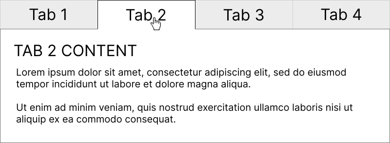
Tabbed interfaces enhance space efficiency at the cost of increased complexity. Improperly implemented interfaces can make it difficult or outright impossible for keyboard users and screen reader users to access their content. These issues arise when tabbed interfaces have incorrect keyboard interactions, ARIA roles and attributes, and/or code structure. The first step in understanding how to identify and correct these issues is determining if the tabbed interface is automatic or manually activated.
Automatic and Manually Activated Tabbed Interfaces
There are two kinds of tabbed interfaces:
- Automatic: When a tab receives keyboard focus or when the user clicks it with the mouse, the associated panel is displayed.
- Manual: When a tab has keyboard focus and the user then hits Spacebar or Enter, or when the user clicks it with the mouse, the associated tab is displayed.
Automatic tabbed interfaces work best when all of the tab panel content is already in the Document Object Model (DOM), so the tabs are only changing what content is visible and has focus. However, if activating a tab triggers a request, the delay to load content can make navigation between tabs a slow process in an automatic tabbed interface. A manual tabbed interface is more appropriate in those situations so users can navigate between tabs without activating them (and loading the content).
We advise modeling automatic tabbed interfaces after the WAI-ARIA Automatic Tabbed Interface. Manual tabbed interfaces should be modeled after the WAI-ARIA Manual Tabbed Interface. Other than their behavior when a tab receives keyboard focus, both automatic and manual tabbed interfaces have similar accessibility requirements.
Keyboard Interactions
Tabbed interfaces have specific keyboard interactions and focus order:
- When focus moves into the tab list, focus must be set on the active tab (the tab with a visible tab panel).
- When a tab has focus, hitting the Tab key must move focus to its associated tab panel. The Tab key must not navigate among the tabs. The
tabindex="-1"attribute should be applied to inactive tabs to ensure they are not focusable when using the Tab key. - Each tab panel should itself be keyboard focusable so that screen readers will announce the panel content beginning at the top. This can be accomplished by applying the
tabindex="0"attribute to the tab panels. - If the tab has an associated context menu, Shift + F10 must open the menu.
- The Home key can be programmed to move focus to the first tab in the tablist, and the End key can move focus to the last tab in the tablist. While not absolutely necessary, this functionality can make navigation much faster for keyboard users, especially if there are several tabs.
Horizontal and Vertical Tab Lists
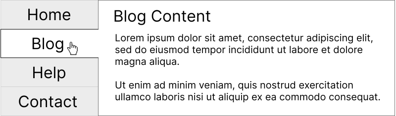
While most tabbed interfaces align their tab list horizontally along the top edge of the panel, some arrange their tab list vertically along the panel's left or right edge. Horizontally-oriented tab lists are the default and do not need the aria-orientation attribute.
When focus is on a tab in a horizontal tab list:
- The ← key must move focus to the previous tab. If focus is on the first tab, focus must move to the last tab.
- The → key must move focus to the next tab. If focus is on the last tab, focus must move to the first tab.
- ↑ and ↓ keys should scroll the page (default behavior).
Vertically-oriented tab lists need aria-orientation="vertical". When focus is on a tab in a vertical tab list:
- The ↑ key must move focus to the previous tab. If focus is on the first tab, focus must move to the last tab.
- The ↓ key must move focus to the next tab. If focus is on the last tab, focus must move to the first tab.
ARIA Roles and Attributes
An accessible tabbed interface needs properly implemented ARIA roles and attributes. There are three core parts to a tabbed interface, each with their own requirements.
Tab list
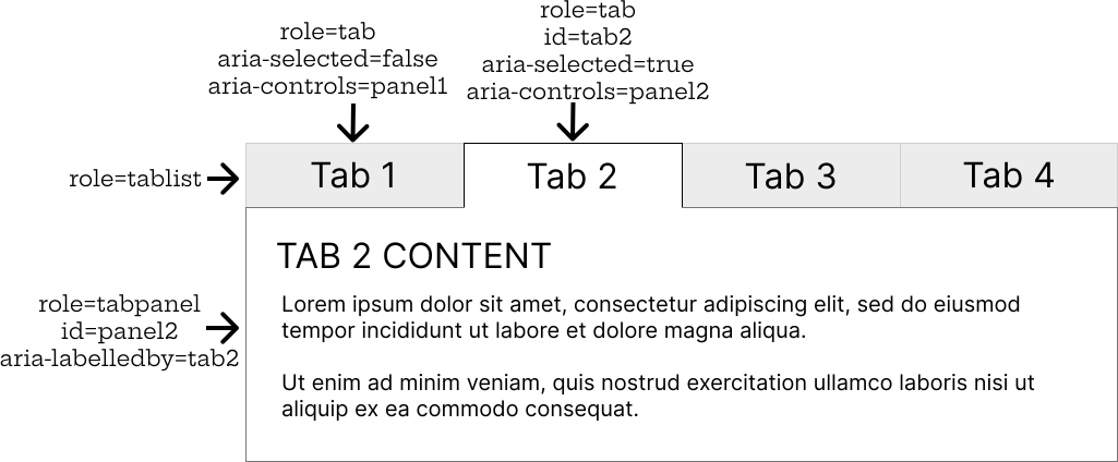
The tab list contains all of the tabs and displays them along one edge of the panel. All tabs must be contained within the tab list element. The tab list element needs role="tablist". If the tab list has a visible label (such as a heading or other text above it), it needs an aria‑labelledby attribute referencing the id attribute of the labeling element. If the tab list has no visible label, it needs to be labeled with aria‑label. The label should accurately describe the tab list.
Tabs
The tabs are contained in the tab list, and activated to display their associated tab panels. The tabs should be coded with the <button> element instead of links since they are about function rather than navigation. Each tab needs an attribute of role="tab". While the tab is active, it needs aria-selected="true". Only one tab should be active at a time; inactive tabs should instead have aria-selected="false". If a tab has a pop-up menu, the tab must have aria-haspopup="menu" (recommended) or aria‑haspopup="true" (deprecated), and the associated pop-up must have role="menu". Each tab should have an aria-controls attribute referencing the id of its associated tab panel.
Tab panel
Each tab panel is associated with a tab, and displayed when that tab is activated. Each tab panel needs role="tabpanel". Each tab panel needs an aria‑labelledby attribute referencing the id of its associated tab.
Node
When the roles and attributes described above are properly implemented, screen readers announce the number of tabs and the user's position within the tab list. The aria-setsize and aria-posinset attributes are redundant and should not be used unless elements will be dynamically injected into the DOM.